

Oodles of Noodles (Power BI)
The Situation:
Oodles of Noodles is a fictional collection of data related to its sales across the United States. It encompasses various attributes, such as revenue, customer preferences, shipment time, etc. Our goal is to transform their raw data into meaningful insights and recommendations for management. More specifically, we need to:
- Track KPIs (revenue, meal kits sold, shipments, customer rating)
- Compare regional and state-level performance
- Identify high-value subscription plans and cuisine types
The Data:
We’ve been given a collection of raw data (CSV files), which contains information about shipments, returns, meal kits, customers, sales territories, and reviews, in a total of 9 tables, from the years 2020-21.
The Task:
We are tasked with using solely Microsoft Power BI to:
- Connect and transform/shape the data in Power BI’s back-end using Power Query
- Build a relational data model, linking the 9 fact and dimension tables
- Create calculated columns and measures with DAX
- Design a multi-page interactive dashboard to visualize the data in Power BI’s front-end
The Process:
1. Connecting and Shaping the Data
Firstly, we imported the data into the Power Query editor to transform and clean it. The process involved:
Removing Duplicates: Duplicate entries were removed from the dataset to ensure accurate analysis.
Handling Null or Missing Values: For some columns, missing values were replaced with defaults or averages. Null values in “key” columns were removed using filters.
Data Type Conversion: Columns were converted to appropriate data types to ensure consistency. Dates were converted to Date type, numerical columns to Decimal or Whole Numbers, and text columns to Text.
Column Splitting and Merging: Several columns were split to separate concatenated information or merged to create a unified name (such as Customer Full Name).
Standardizing Date Formats: All date columns were formatted consistently to facilitate time-based analysis. This step was important for ensuring accurate time-series analysis in Power BI.
Removing Unnecessary Columns: Irrelevant columns were removed to streamline the dataset. This helped focus the analysis on relevant information, reducing memory usage and improving performance.
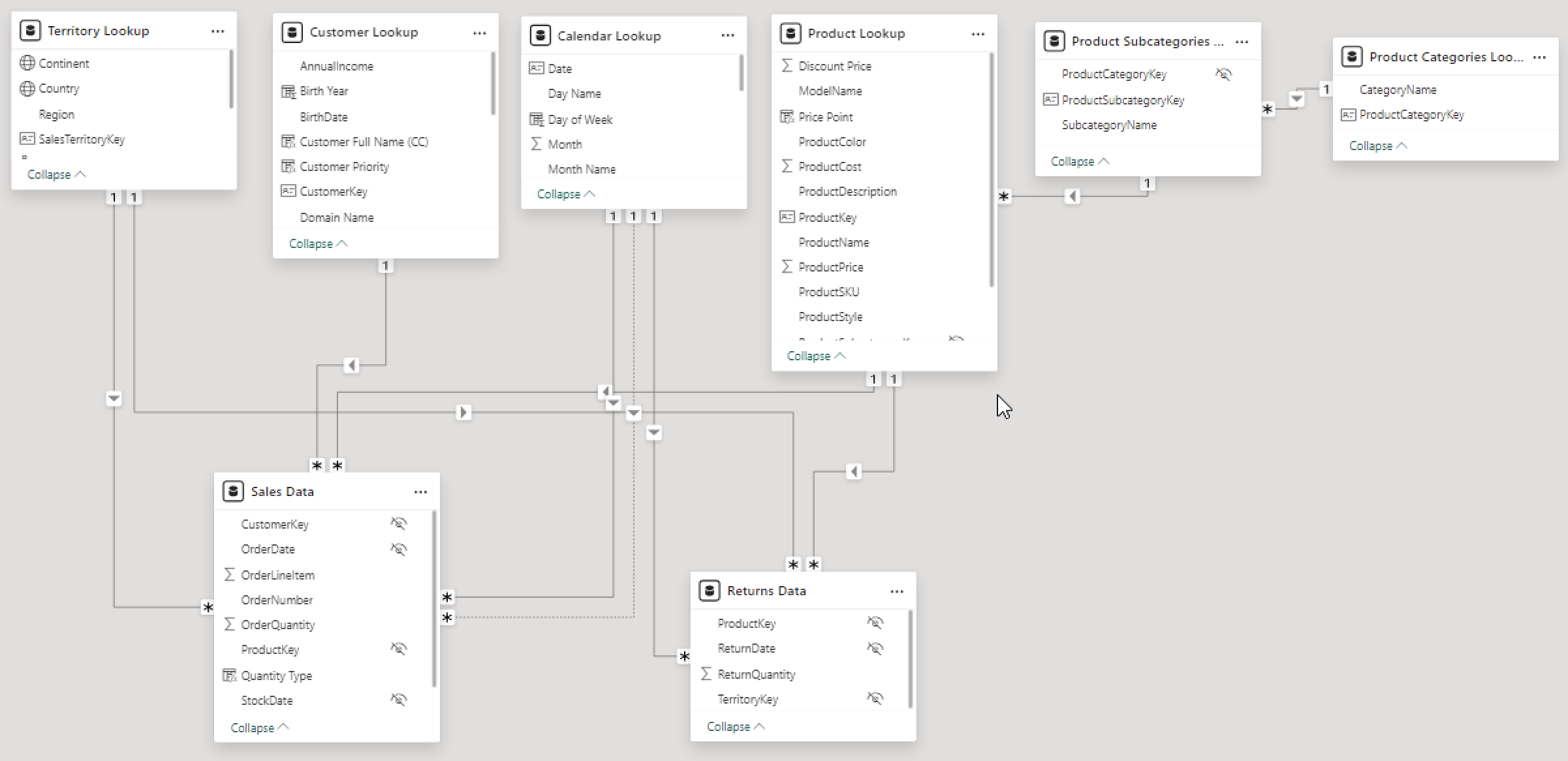
2. Building a Relational Data Model
Secondly, we modeled the data to create a snowflake schema. This process involved creating relationships between the dimension and fact tables, ensuring cardinalities were one-to-many relationships.
We enabled active or inactive relationships, creating hierarchies for fields such as Geography (Continent-Country-Region) and Date (Start of Year-Start of Month-Start of Week-Date), and finally hid the foreign keys from the report view to ease the data analysis and visualization steps and reduce errors.
3. Creating Calculated Columns and Measures
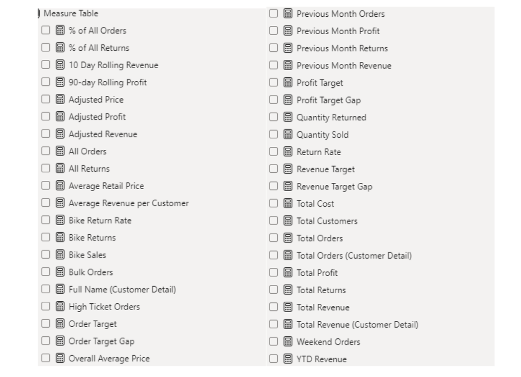
Next, we used Power BI’s front-end formula language, DAX, to analyze our relational data model and create several calculated columns (for filtering) and measures (for aggregation) that we could later reference and use when analyzing and visualizing the data.
We used calculated columns to determine whether a customer is active and a loyal member.
The list of calculated measures includes key information on revenue, total shipments, reviews, SLA, and more.
4. Visualizing the Data
The final step of the project was creating a multi-page interactive dashboard, including a range of visuals and KPIs that could serve management and lead to informed decision-making. We used several visuals and tools to demonstrate and visualize the data across 4 report pages, including KPI cards, line and bar charts, matrices, gauge charts, and tree maps. We ensured the report was fully interactive and simple to navigate, with icons used to enable filters, cancel filters, and guide users to each report page with ease. Features such as drill-through, bookmarks, parameters, and tooltips were also used throughout the dashboard, further enhancing its usefulness and impact on management.
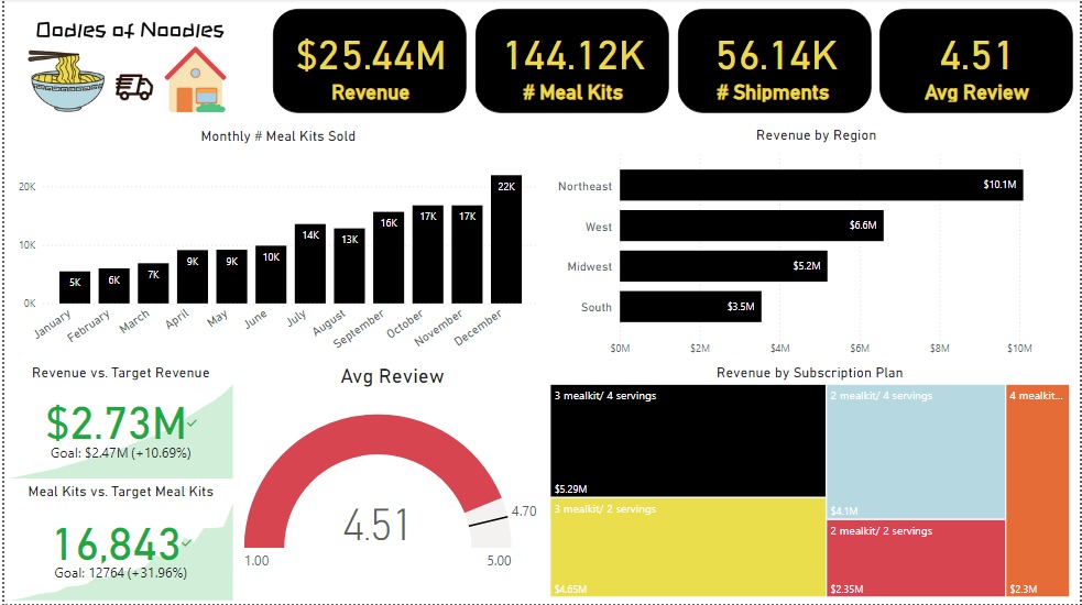
Executive Dashboard: The first report page presents an overview of Oodles of Noodles’ performance. We used card visuals for KPIs like revenue, meal kits sold, shipments, and average customer ratings. Additional cards compare current vs. previous month performance, showing trends, while a clustered bar chart displays revenue by region, a gauge chart shows average ratings, and a tree map highlights the top 5 subscription plans by revenue.
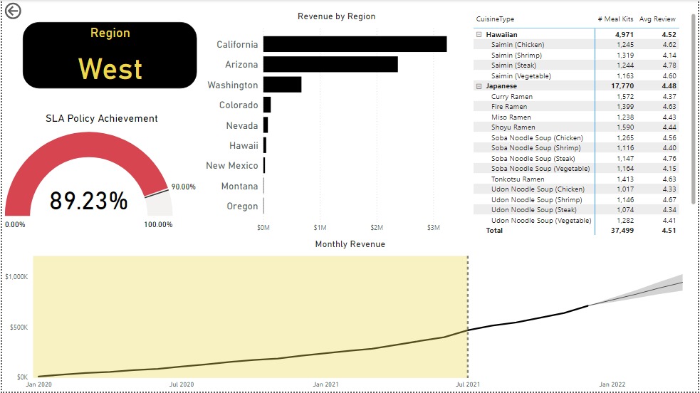
Region: The second report page is a drill-through by region for detailed performance analysis. It includes a bar chart for state-level revenue, a matrix showing cuisine types by meal kits sold and average ratings, a gauge chart for SLA policy adherence, and a line chart for revenue trends from 2020-2021. This page reveals Oodles of Noodles’ sales distribution by region and state.
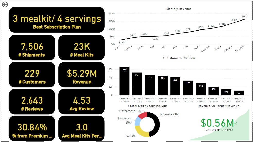
Subscription: The third report page dives into subscription-level analysis. It features a line chart of monthly revenue, cards showing the Best Subscription Plan with total shipments, meal kits, customers, revenue, reviews, average reviews per customer, premium plan percentage, and average meal kits per customer. Additionally, there’s a clustered column chart for customers per subscription plan, a donut chart for meal kits by cuisine, and a KPI card comparing current vs. previous month revenue.
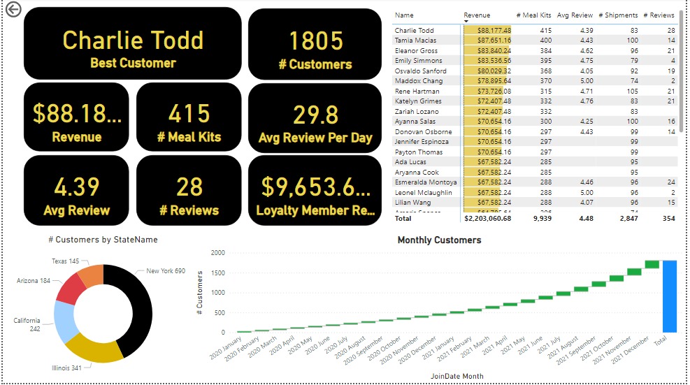
Customer Detail: The final report page provides deep insights into customer behavior. A donut chart shows total customers by state, a matrix lists meal kits, revenue, and reviews, and cards display total customers, average reviews per day, loyalty member revenue, the best customer’s revenue, reviews, average review, meal kits, average reviews, and shipments. Lastly, a waterfall chart shows Monthly Customers.