

CRM and Sales Pipelines (Power BI)
The Situation:
CRM is a collection of data related to its sales across multiple countries. It encompasses various attributes, such as total leads, conversion rate, total deal value, etc. Our goal is to transform their raw data into meaningful insights and recommendations for management. More specifically, we need to:
- Track KPIs (total leads, total deal value, leads closed, closed deal value, conversion rate, lost rate.)
- Provide insights into lead distribution across countries, industries, and organization sizes.
- Identify the health of the sales pipeline, forecast potential income over the next few months, and compare sales agent performance.
The Data:
We’ve been given a collection of raw data (CSV file), which contains information about organizations, industries, country, product, lead acquisition date, expected and closed date, and deal value, in a total of 1 table, from January 2024 to September 2024.
The Task:
We are tasked with using solely Microsoft Power BI to:
- Connect and transform/shape the data in Power BI’s back-end using Power Query
- Build a relational data model, linking the 5 fact and dimension tables
- Create calculated columns and measures with DAX
- Design a multi-page interactive dashboard to visualize the data in Power BI’s front-end
The Process:
1. Connecting and Shaping the Data
Firstly, we imported the data into the Power Query editor to transform and clean it. The process involved:
Removing Duplicates: Duplicate entries were removed from the dataset to ensure accurate analysis.
Handling Null or Missing Values: For some columns, missing values were replaced with defaults or averages. Null values in “key” columns were removed using filters.
Data Type Conversion: Columns were converted to appropriate data types to ensure consistency. Dates were converted to Date type, numerical columns to Decimal or Whole Numbers, and text columns to Text.
Column Splitting and Merging: Several columns were split to separate concatenated information or merged to create a unified name.
Standardizing Date Formats: All date columns were formatted consistently to facilitate time-based analysis. This step was important for ensuring accurate time-series analysis in Power BI.
Removing Unnecessary Columns: Irrelevant columns were removed to streamline the dataset. This helped focus the analysis on relevant information, reducing memory usage and improving performance
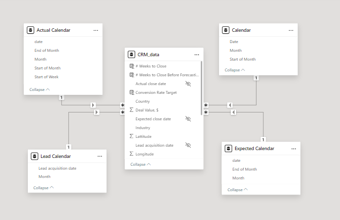
2. Building a Relational Data Model
Secondly, we modeled the data to create a star schema. This process involved creating relationships between the dimension and fact tables, ensuring cardinalities were one-to-many relationships.
We enabled active or inactive relationships, created hierarchies for fields such as Date (Month-End of Month-Start of Month-Start of Week), and finally hid the foreign keys from the report view to ease the data analysis and visualization steps and reduce errors.
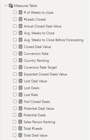
3. Creating Calculated Columns and Measures
Next, we used Power BI’s front-end formula language, DAX, to analyze our relational data model and create several calculated columns (for filtering) and measures (for aggregation) that we could later reference and use when analyzing and visualizing the data.
The list of calculated measures includes avg. weeks to close, # of leads closed, lost deal value, sales person ranking and more.
4. Visualizing the Data
The final step of the project was creating a multi-page interactive dashboard, including a range of visuals and KPIs that could serve management and lead to informed decision-making. We used several visuals and tools to demonstrate and visualize the data across 2 report pages, including KPI cards, line and column charts, matrices, bar charts, and pie charts. We ensured the report was fully interactive, with slicers used to enable filters, and allow users to each report page with ease. Features such as parameters were also used throughout the dashboard, further enhancing its usefulness and impact on management.
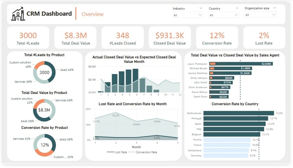
Overview Dashboard: The first report page provides a high-level view of CRM’s overview. We used card visuals to present Key Performance Indicators such as Total Leads, Total Deal Value, # Leads Closed, Closed Deal Value, Conversion Rate and Lost Rate. We also included pie charts to show distribution of total leads, total deal value and conversion rate between products, a line chart to represent monthly lost rate and conversion rate, a line and clustered column chart to compare actual closed deal value and expected closed deal value by month, a clustered bar chart to show comparison between total deal value and closed deal value by sales agent, and a clustered bar chart to display conversion rate by country.
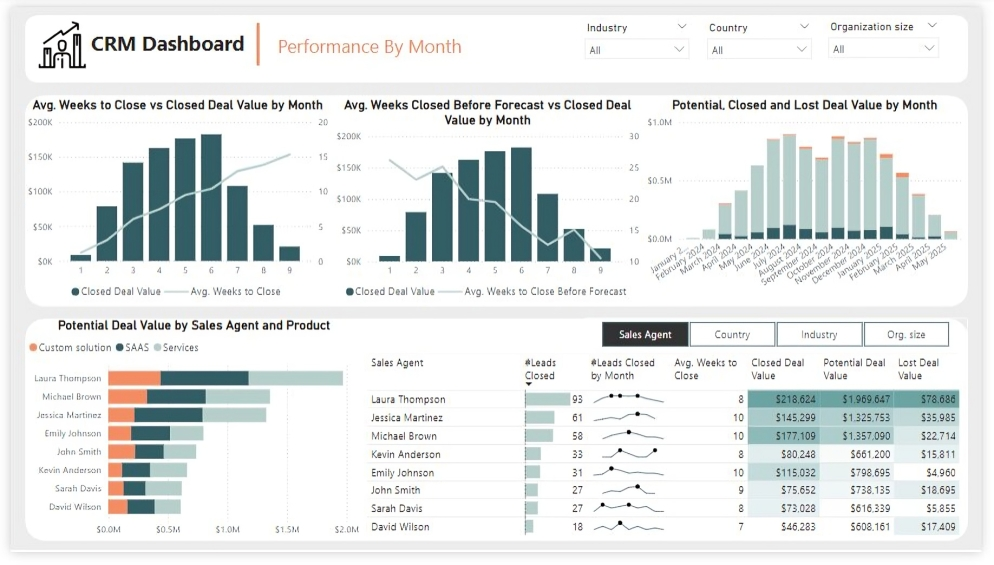
Performance by Month: The second report page is to further analyze the sales agent performance and monthly distribution of closed, expected and potential deal values. It consists of a line and clustered column chart that shows average weeks to close vs closed deal value by month, second line and clustered column chart to display average weeks closed before forecast vs closed deal value by month, a stacked column chart to show potential, closed and lost deal value from January to September 2024, a stacked column chart to display distribution of potential deal value by sales agent and product, and a matrix that visualizes performance of salespersons, countries, industries and organization size in closed leads, average weeks, and closed, potential and lost deal values, with addition of spark lines to display their monthly closed leads.