

Marketing Campaign Analysis (Power BI)
The Situation:
The Marketing Campaign Analysis dataset is provided by a UK-based clothing retailer, containing data on sales performance throughout the United Kingdom. It includes details such as revenue, campaigns, devices, channels, and more. Our goal is to transform this raw data into insightful recommendations for management. Specifically, we aim to:
- Monitor key performance indicators (KPIs) like revenue, profit, clicks, and customer ratings.
- Evaluate campaign performance across cities, channels, devices, and individual advertisements.
The Data:
We received CSV files containing information on campaigns, channels, devices, clicks, conversions, impressions, ads, and location in a single table, covering the period from March 2023 to November 2023.
The Task:
We are tasked with employing solely Microsoft Power BI to:
- Connect and transform/shape the data using Power Query.
- Construct a relational data model linking fact and dimension tables.
- Create calculated columns and measures using DAX.
- Design a multi-page interactive dashboard to visualize the data.
The Process:
1. Connecting and Shaping the Data
Firstly, we imported the data into the Power Query editor for transformation and cleaning. This process involved:
Removing Duplicates: Duplicate entries were eliminated from the dataset to ensure accurate analysis.
Data Type Conversion: Columns were adjusted to appropriate data types for consistency. Dates were converted to Date type, numerical columns to Decimal or Whole Numbers, and text columns to Text.
Standardizing Date Formats: All date columns were formatted uniformly to facilitate time-based analysis, a crucial step for ensuring accurate time-series analysis in Power BI.
Removing Unnecessary Columns: Irrelevant columns were discarded to streamline the dataset. This helped focus the analysis on essential information, reducing memory usage and enhancing performance.
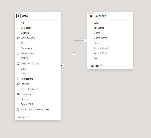
2. Building a Relational Data Model
Secondly, we modeled the data to create a snowflake schema. This process involved establishing relationships between the dimension and fact tables, ensuring cardinalities were set to one-to-many relationships.
We hid the foreign keys from the report view to simplify data analysis and visualization steps and minimize errors.
3. Creating Calculated Columns and Measures
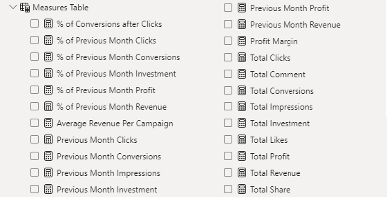
Next, we utilized Power BI’s front-end formula language, DAX, to analyze our relational data model and produce several calculated columns (for filtering) and measures (for aggregation) for later reference when analyzing and visualizing the data.
The list of calculated measures includes key information on revenue, profit, impressions, clicks, conversions, investment, and more.
4. Visualizing the Data
The final step of the project was the creation of a multi-page interactive dashboard, featuring a variety of visuals and KPIs that could assist management and facilitate informed decision-making. We employed several visuals and tools across 3 report pages, including KPI cards, line, column and bar charts, matrices, donut charts, tree maps, and map charts. We ensured the report was fully interactive and easy to navigate, incorporating icons to enable filters, remove filters, and guide users to each report page with ease. Features such as parameters and navigation buttons were also included throughout the dashboard, further enhancing its utility and impact on management..
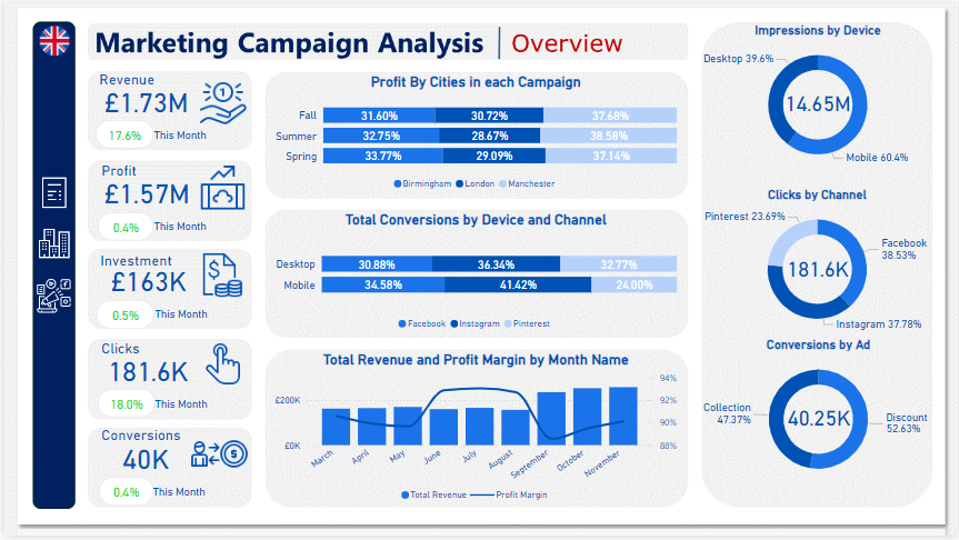
Overview Dashboard: The first report page provides a high-level view of the overall performance of Marketing Campaigns. We used card visuals to present Key Performance Indicators such as total revenue, profit, investment, clicks, and conversions. Additionally, we included two 100% stacked bar charts: the first to analyze the distribution of profit generated by cities in each campaign, and the second to observe the distribution of conversions achieved from various channels on each device. A line and stacked column chart was also included to compare revenue and profit margins by month, along with three donut charts to showcase total impressions by devices, clicks by channels, and conversions by ads, each donut chart also displaying the total of matrices.
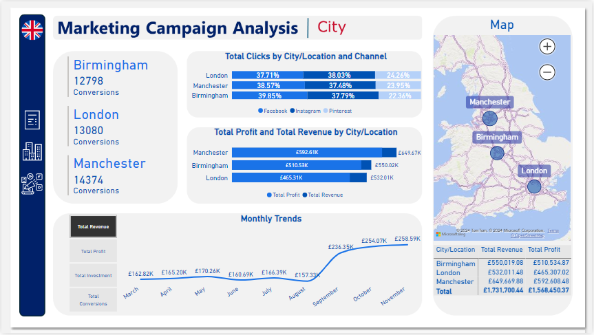
City: The second report page acts as a navigation page by city to further analyze performance in specific locations. It consists of cards illustrating the number of conversions in each city, a 100% stacked bar chart that displays the percentage of total clicks tracked on each channel across different cities, a clustered bar chart revealing the revenue and profit generated in each city, a map chart displaying total revenue by city, and a matrix chart showing revenue and profit by city. A line chart with matrices slicer visualizes the trending revenue, profit, investment, and conversions from March 2023 to November 2023, highlighting long-term performance. This provides insights into Oodles of Noodles’ sales distribution by city.
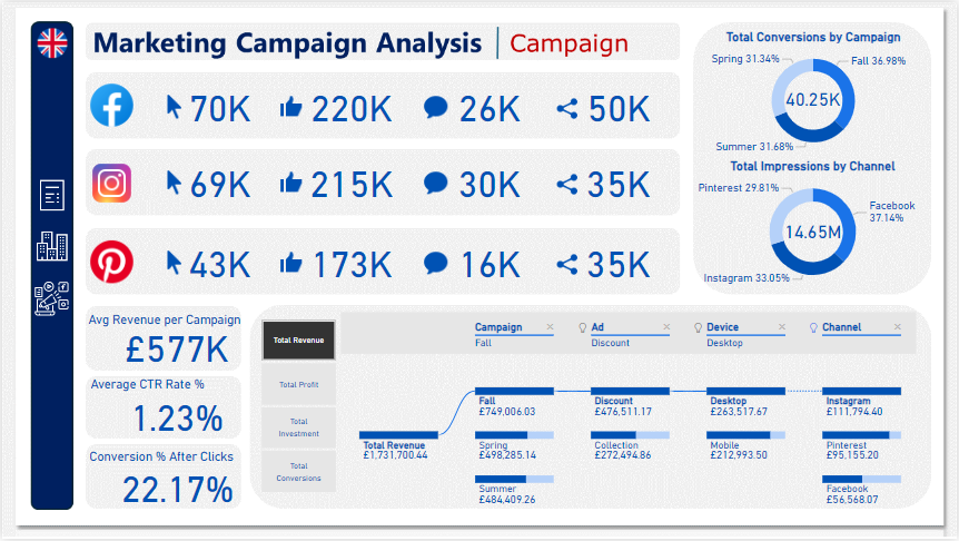
Campaign: The third and final report page focuses on detailed campaign performance. It includes cards displaying total clicks, likes, comments, and shares by channel, as well as additional cards showing average revenue per campaign, average CTR rate percentage, and conversion rates after clicks. Two donut charts illustrate conversions by campaign and impressions by channels, each displaying total matrix values. Additionally, a decomposition tree was employed to analyze the breakdown of total revenue, profit, investment, and conversion into various categories, including campaigns, ads, devices, and channels.