

E-commerce KPI Analysis (Power BI)
The Situation:
E-commerce KPI Analysis is a collection of data related to its sales across multiple countries around the world. It encompasses various attributes, such as orders, sales, products, market, etc. Our goal is to transform their raw data into meaningful insights and recommendations for management. More specifically, we need to:
- Track KPIs (orders, sales, profit, quantity, profit margin)
- Compare regional and state-level performance
- Identify product effectiveness and customer behavior
The Data:
We’ve been given a collection of raw data (CSV files), which contains information about orders, quantity, sales, discount, products, categories, customers, segments, regions, markets and others, in a total of a single table, from the years 2020-23.
The Task:
We are tasked with using solely Microsoft Power BI to:
- Connect and transform/shape the data in Power BI’s back-end using Power Query
- Build a relational data model, linking the 2 fact and dimension tables
- Create calculated columns and measures with DAX
- Design a multi-page interactive dashboard to visualize the data in Power BI’s front-end
The Process:
1. Connecting and Shaping the Data
Firstly, we imported the data into the Power Query editor to transform and clean it. The process involved:
Removing Duplicates: Duplicate entries were removed from the dataset to ensure accurate analysis.
Data Type Conversion: Columns were converted to appropriate data types to ensure consistency. Dates were converted to Date type, numerical columns to Decimal or Whole Numbers, and text columns to Text.
Standardizing Date Formats: All date columns were formatted consistently to facilitate time-based analysis. This step was important for ensuring accurate time-series analysis in Power BI.
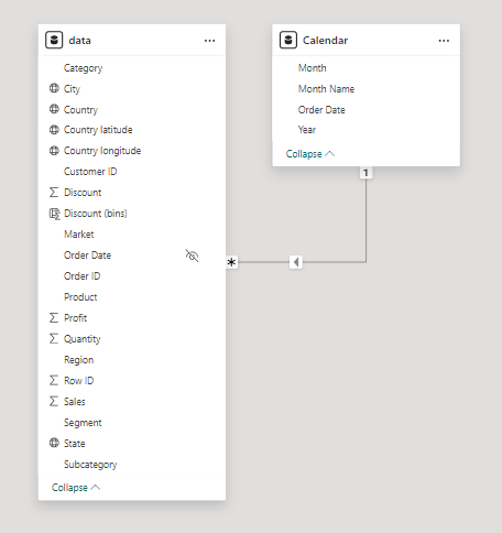
2. Building a Relational Data Model
Secondly, we modeled the data to create a snowflake schema. This process involved creating relationships between the dimension and fact tables, ensuring cardinalities were one-to-many relationships.
We enabled active or inactive relationships, created hierarchies for fields such as Geography (City-State-Country-Region) and finally hid the foreign keys from the report view to ease the data analysis and visualization steps and reduce errors.
3. Creating Calculated Columns and Measures
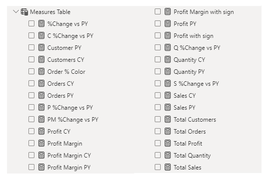
Next, we used Power BI’s front-end formula language, DAX, to analyze our relational data model and create several calculated columns (for filtering) and measures (for aggregation) that we could later reference and use when analyzing and visualizing the data.
We used calculated columns to categorize discount into defined groups. The list of calculated measures includes key information on sales, customers, orders, profit, quantity, and more.
4. Visualizing the Data
The final step of the project was creating a multi-page interactive dashboard, including a range of visuals and KPIs that could serve management and lead to informed decision-making. We used several visuals and tools to demonstrate and visualize the data across 3 report pages, including KPI cards, line, column and bar charts, matrices, donut charts, slicers, and maps. We ensured the report was fully interactive and simple to navigate, with icons used to enable filters, cancel filters, and guide users to each report page with ease. Features such as bookmarks and parameters were also used throughout the dashboard, further enhancing its usefulness and impact on management.
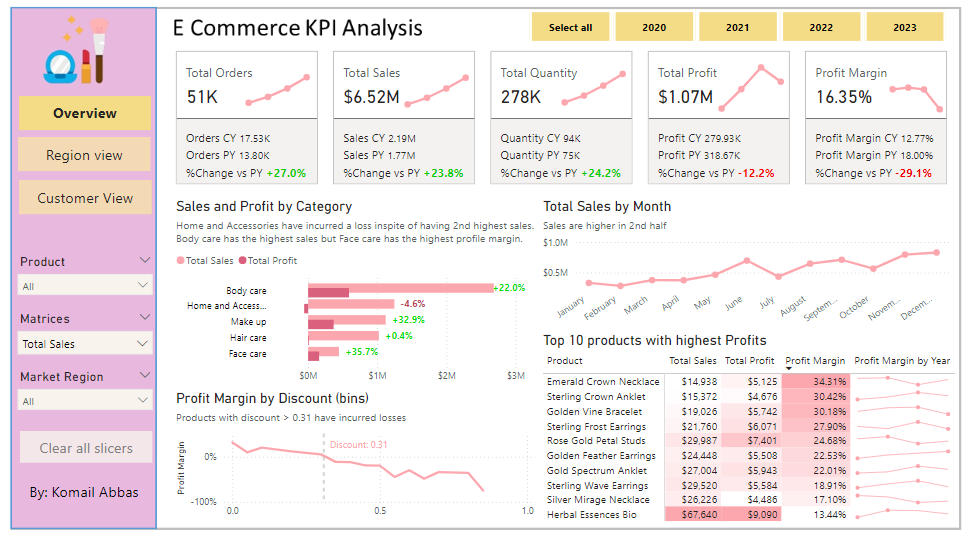
Overview Dashboard: The first report page provides a high-level view of overall performance. We used card visuals to present Key Performance Indicators such as overall sales, number of orders, quantity sold, profit and profit margin. We also included current and previous year performances of those matrices, providing insights into recent trends, a clustered bar chart to show sales and profit by product category, a line chart to display sales monthly trends, another line chart to show profit margin by discount segments, and a matrix to display the top 10 products with their overall sales, profit, profit margin profit margin by year.
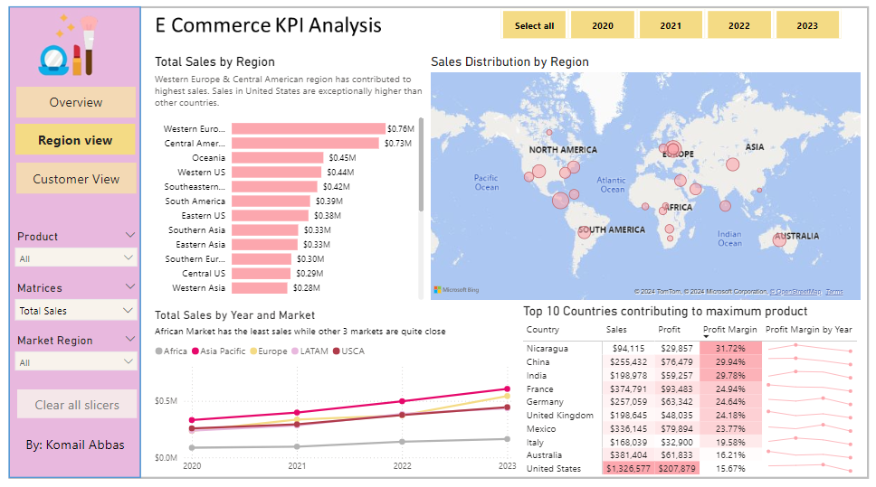
Region View: The second report page is a regional overview page to further analyze the performance in a specific region. It consists of a clustered bar chart that shows sales by regions, a map chart to display sales distribution by regions, a line chart to visualize yearly sales of markets, and a matrix chart that displays top 10 countries with their sales, profit, profit margin and profit margin by year. This offers insight into sales distribution by region.
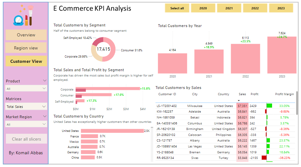
Customer View: The third and final report page provides deeper insight into customer behavior and value. It uses a donut chart to show total customers by segments, a column chart to show total customers by year, a clustered bar chart to display total sales and profit generated by segments, one more bar chart to show total customers by country, and a matrix to present customer’s purchase details, including city and country of order, sales, generated profit and profit margin.