

Projects Category: Standard
- Home
- Standard
The Situation:
365 Business Bank Analysis is a collection of data related to the sales of thousands of online courses related to business finance, graphic design, web development, and musical instruments. It encompasses various attributes, such as revenue, course name, duration, etc. Our goal is to transform their raw data into meaningful insights and recommendations for management. More specifically, we need to:
- Enhance customer segmentation and personalization.
- Optimize resource allocation and operational efficiency.
- Identify and mitigate potential risks and fraud.
- Drive strategic initiatives that foster growth and competitive advantage.
The Data:
We’ve been given a collection of raw data (CSV files), which contains information about course title, price, number of subscribers, subject, published timestamp, and more, in a single table, from the years 2022-24.
The Task:
We are tasked with using solely Microsoft Power BI to:
- Connect and transform/shape the data in Power BI’s back-end using Power Query
- Build a relational data model, linking the 6 fact and dimension tables
- Create calculated columns and measures with DAX
- Design a multi-page interactive dashboard to visualize the data in Power BI’s front-end
The Process:
1. Connecting and Shaping the Data
Firstly, we imported the data into the Power Query editor to transform and clean it. The process involved:
Removing Duplicates: Duplicate entries were removed from the dataset to ensure accurate analysis.
Handling Null or Missing Values: For some columns, missing values were replaced with defaults or averages. Null values in “key” columns were removed using filters.
Data Type Conversion: Columns were converted to appropriate data types to ensure consistency. Dates were converted to Date type, numerical columns to Decimal or Whole Numbers, and text columns to Text.
Standardising Date Formats: All date columns were formatted consistently to facilitate time-based analysis. This step was important for ensuring accurate time-series analysis in Power BI.
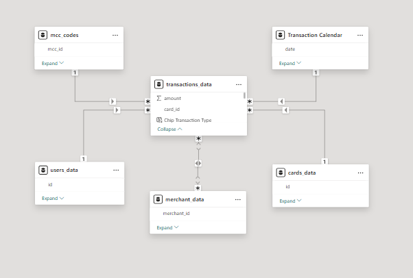
2. Building a Relational Data Model
Secondly, we modeled the data to create a snowflake schema. This process involved creating relationships between the dimension and fact tables, ensuring cardinalities were one-to-many relationships.
We enabled active or inactive relationships and hid the foreign keys from the report view to ease the data analysis and visualization steps and reduce errors.
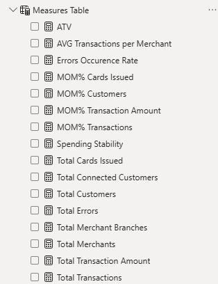
3. Creating Calculated Columns and Measures
Next, we used Power BI’s front-end formula language, DAX, to analyze our relational data model and create several calculated columns (for filtering) and measures (for aggregation) that we could later reference and use when analyzing and visualizing the data.
We used calculated columns to determine whether a course is very cheap, cheap, moderate or expensive.
The list of calculated measures includes key information on total transactions, total customers, total merchants, average transaction value, and more.
4. Visualizing the Data
The final step of the project was creating a multi-page interactive dashboard, including a range of visuals and KPIs that could serve management and lead to informed decision-making. We used several visuals and tools to demonstrate and visualize the data across 4 report pages, including KPI cards, line, column, and bar charts, matrices, and donut charts. We ensured the report was fully interactive and simple to navigate, with icons used to enable filters, cancel filters, and guide users to each report page with ease. Features such as bookmarks and parameters were also used throughout the dashboard, further enhancing its usefulness and impact on management.
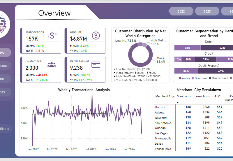
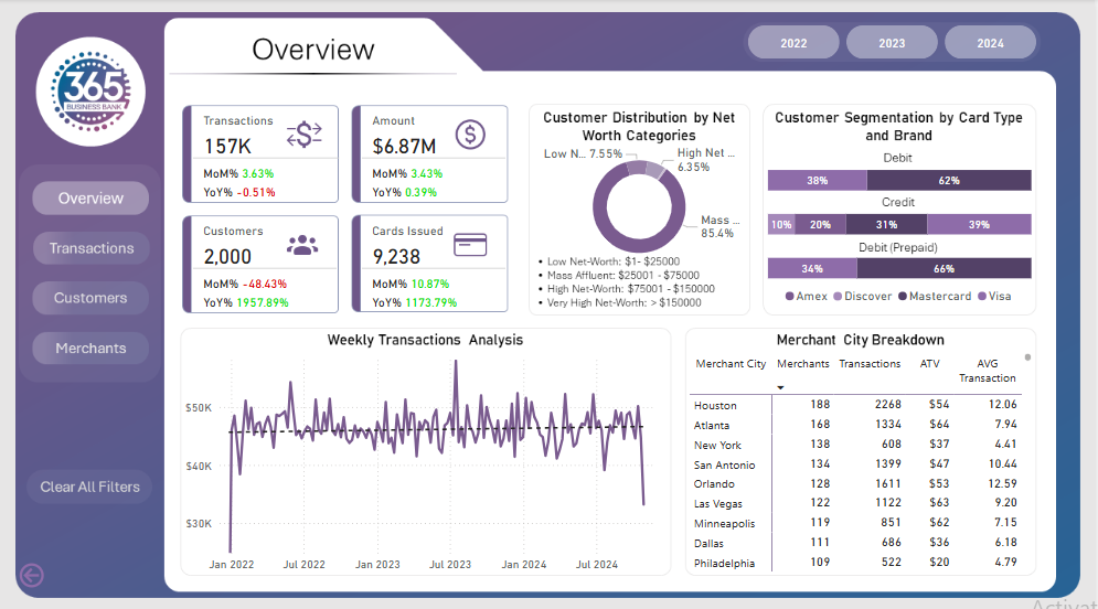
Overview Dashboard: The first report page presents an overview of overall performance. We used card visuals for KPIs like transactions, total amount, total customers, total cards issued to all customers. A 100% stacked bar chart is included to visualize the partition of card types in different card brands. We have used a donut chart, displaying the customer distribution by net worth category. A line chart is to show the weekly transactions and a matrix chart to show the merchant city breakdown.
Transactions: The second report page dives into transactional analysis. It consists of cards to present the total errors, error rate %, and most common error. Additionally, a dynamic scatter chart is included to show the transactions, spent amount, and errors by total customers and their credit score. Two donut chart to show total transactions by chip type and card ownership respectively, a line chart to display weekly error detection during transactions, and a column and line chart to present the distribution of transactions and ATV trends by months.
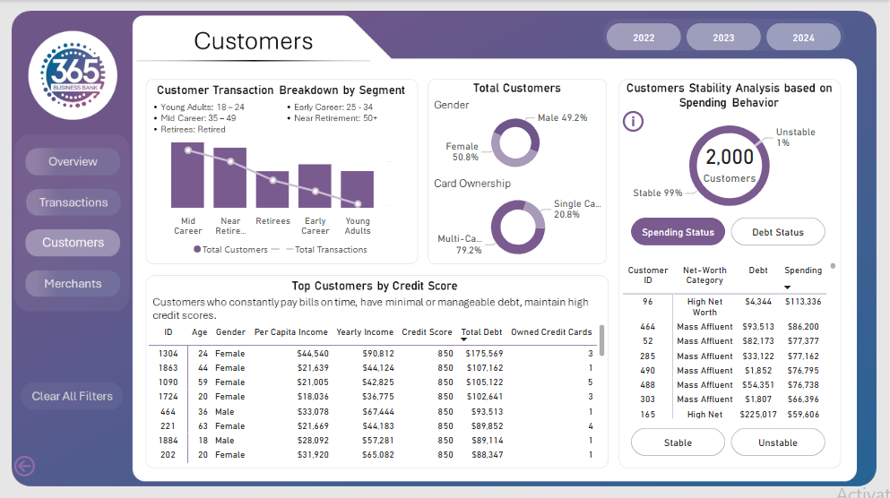
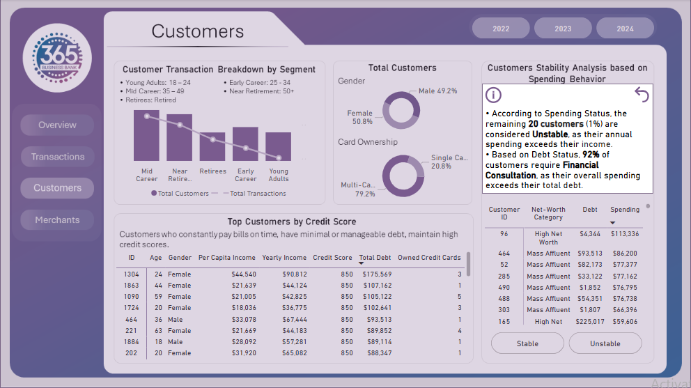
Customers: The third report page provides deep insights into the customer behavior. A column and line to display customer transaction breakdown by age segment. Two donut charts to show total customers by gender and card ownership, a matrix chart shows the distribution of top customers (based on credit score) in age, gender, per capita income, yearly income, credit score total debt and owner credit cards. Lastly, a dynamic combination of a donut and a matrix chart is used to analyze the stability of customers through their spending behavior, donut to show stable and unstable customers and matrix to show their net-worth category, debt and spending.
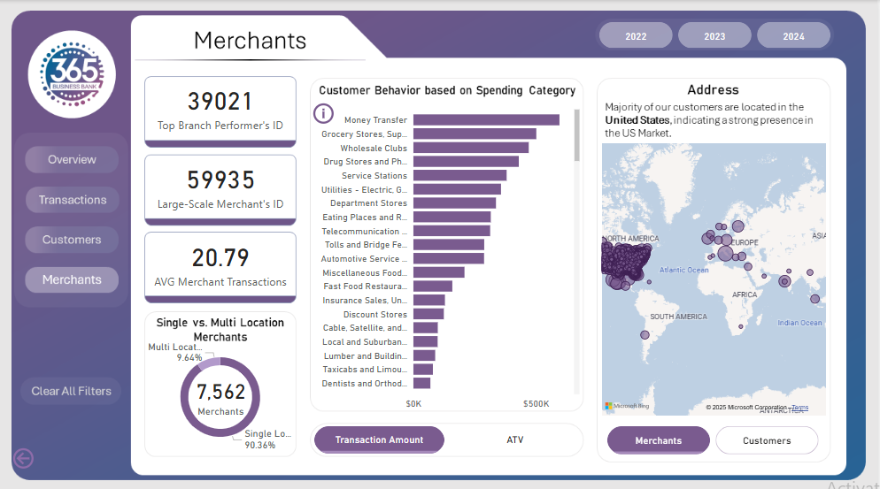
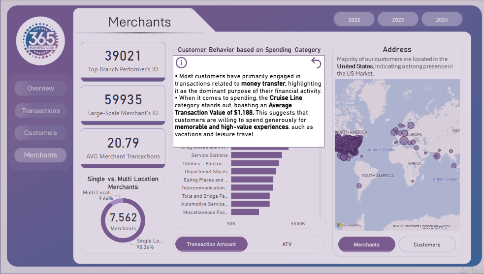
Merchants Dashboard: The fourth and final report page displays the overall performance by our merchants. We used card visuals to show top branch performer’s id, large scale merchant’s id and average merchant transactions. A pie chart is included to visualize the partition of merchants in single and multiple location category. A dynamic bar chart to display customers’ total transactions and average transactions based on the spending category. A map chart to display the address of merchants and customers with their transaction value.
Udemy Course Analysis (Power BI)
The Situation:
Udemy Course Analysis is a collection of data related to the sales of thousands of online courses related to business finance, graphic design, web development, and musical instruments. It encompasses various attributes, such as revenue, course name, duration, etc. Our goal is to transform their raw data into meaningful insights and recommendations for management. More specifically, we need to:
- Track KPIs (revenue, total courses, total subscribers, total lectures, total reviews, average revenue per customer)
- Compare course type and price category performance
- Identify high-value courses and course subjects
The Data:
We’ve been given a collection of raw data (CSV files), which contains information about course title, price, number of subscribers, subject, published timestamp, and more, in a single table, from the years 2011-17.
The Task:
We are tasked with using solely Microsoft Power BI to:
- Connect and transform/shape the data in Power BI’s back-end using Power Query
- Build a relational data model, linking the 2 fact and dimension tables
- Create calculated columns and measures with DAX
- Design a multi-page interactive dashboard to visualize the data in Power BI’s front-end
The Process:
1. Connecting and Shaping the Data
Firstly, we imported the data into the Power Query editor to transform and clean it. The process involved:
Removing Duplicates: Duplicate entries were removed from the dataset to ensure accurate analysis.
Data Type Conversion: Columns were converted to appropriate data types to ensure consistency. Dates were converted to Date type, numerical columns to Decimal or Whole Numbers, and text columns to Text.
Standardizing Date Formats: All date columns were formatted consistently to facilitate time-based analysis. This step was important for ensuring accurate time-series analysis in Power BI.
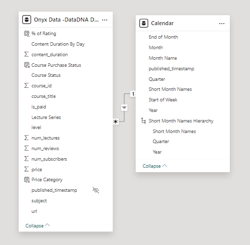
2. Building a Relational Data Model
Secondly, we modeled the data to create a snowflake schema. This process involved creating relationships between the dimension and fact tables, ensuring cardinalities were one-to-many relationships.
We enabled active or inactive relationships, creating hierarchies for fields such as Date (Year-Quarter-Month), and finally hid the foreign keys from the report view to ease the data analysis and visualization steps and reduce errors.
3. Creating Calculated Columns and Measures
Next, we used Power BI’s front-end formula language, DAX, to analyze our relational data model and create several calculated columns (for filtering) and measures (for aggregation) that we could later reference and use when analyzing and visualizing the data.
We used calculated columns to determine whether a course is very cheap, cheap, moderate or expensive.
The list of calculated measures includes key information on revenue, total subscribers, total courses, average course duration, and more.
4. Visualizing the Data
The final step of the project was creating a multi-page interactive dashboard, including a range of visuals and KPIs that could serve management and lead to informed decision-making. We used several visuals and tools to demonstrate and visualize the data across 3 report pages, including KPI cards, line, column, and bar charts, matrices, donut charts, and decomposition trees. We ensured the report was fully interactive and simple to navigate, with icons used to enable filters, cancel filters, and guide users to each report page with ease. Features such as bookmarks and parameters were also used throughout the dashboard, further enhancing its usefulness and impact on management.
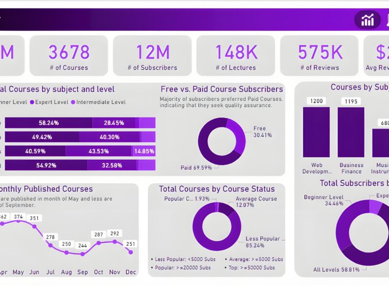
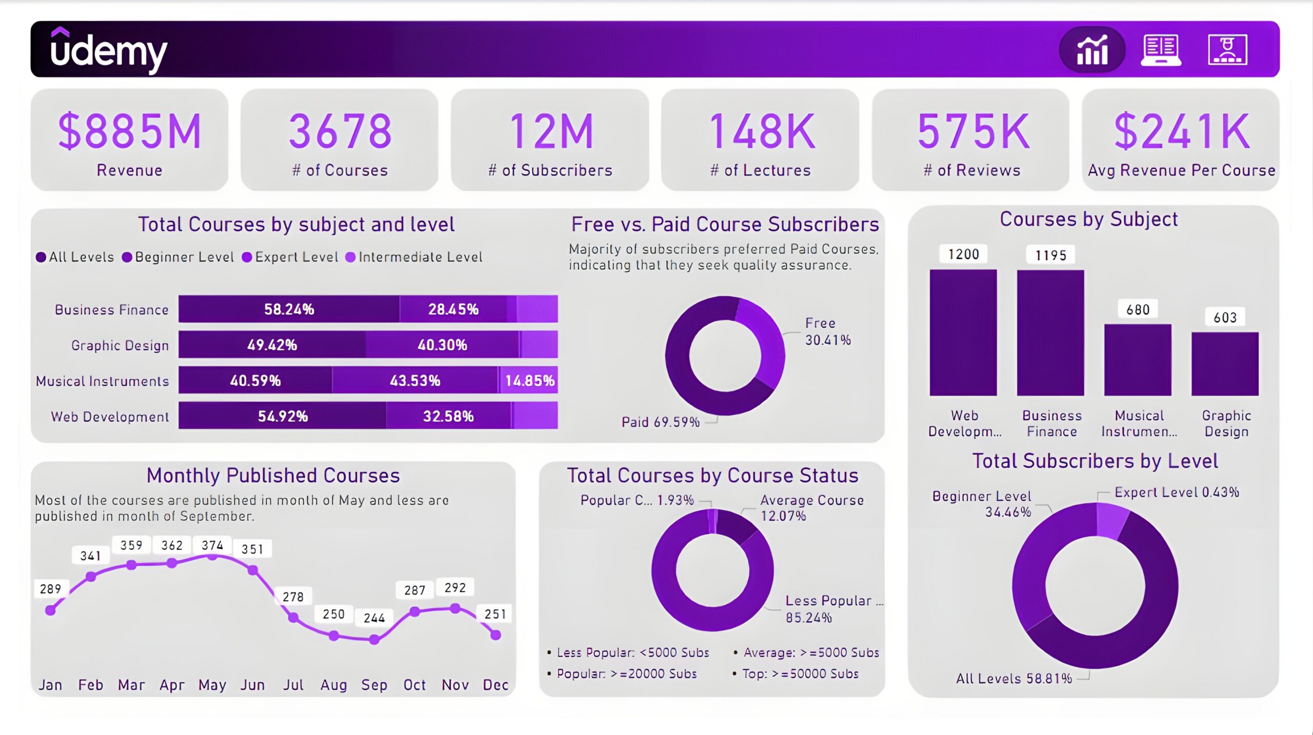
Executive Dashboard: The first report page presents an overview of overall performance. We used card visuals for KPIs like revenue, total courses, total subscribers, total lectures, total reviews, and average revenue per customer. A 100% stacked bar chart is included to visualize the partition of total courses in different course levels of other subjects. We have used three donut charts, the first chart shows a comparison between free and paid course subscribers, the second chart shows total courses by course status and the last chart shows the total subscribers at each level. A column chart to display the total courses by subjects and a line chart to show the monthly trend of published courses.
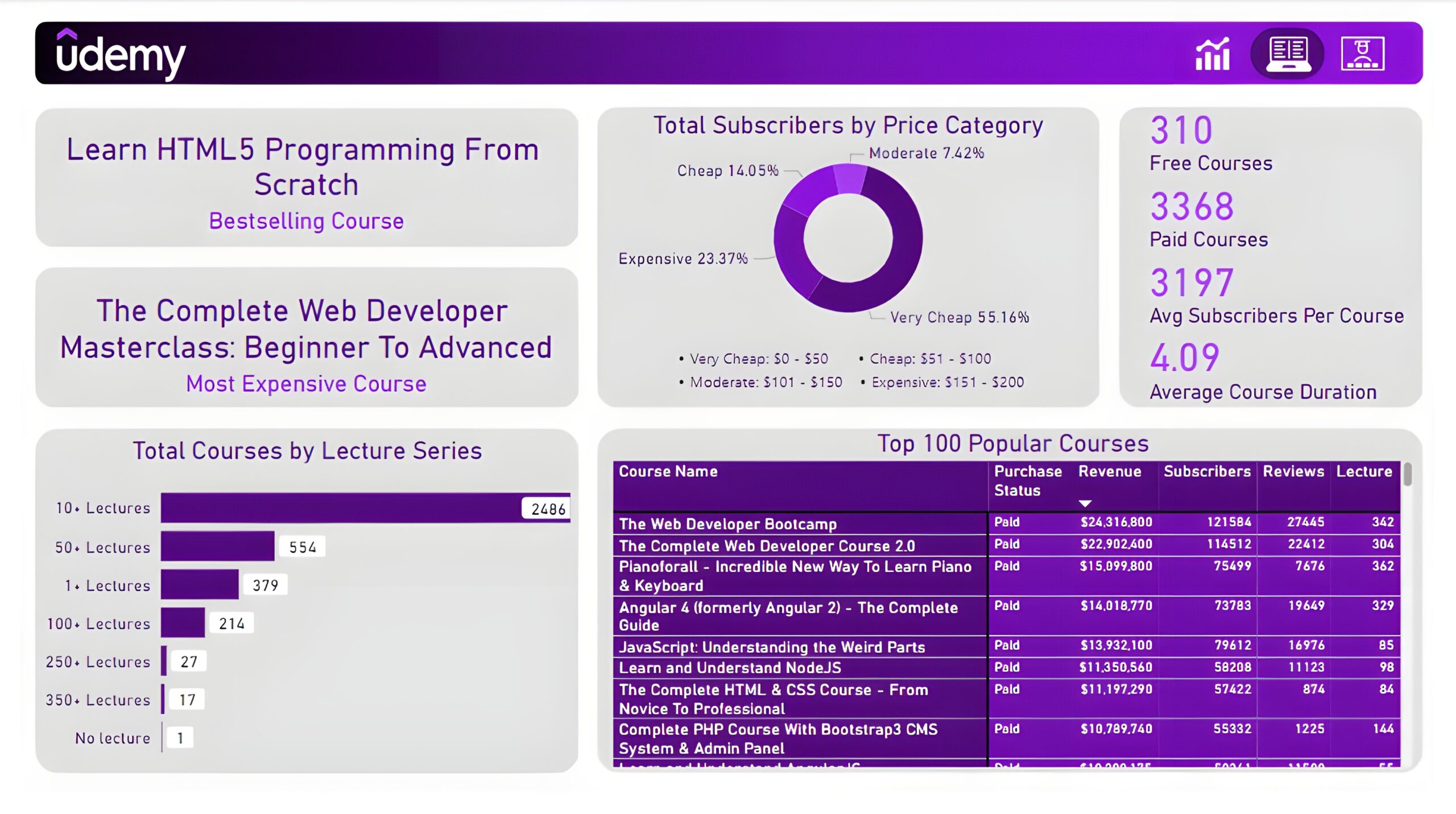
Courses: The second report page dives into course performance analysis. It consists of cards to present the bestselling course and most expensive course. Additional cards were included to show the number of free courses, paid courses, average subscribers per course, and average course duration. A donut chart to show total subscribers by price category, a bar chart to display total courses by lecture series, and a matrix chart to present the top 100 popular courses with their purchase status, revenue, subscribers, reviews, and lectures.
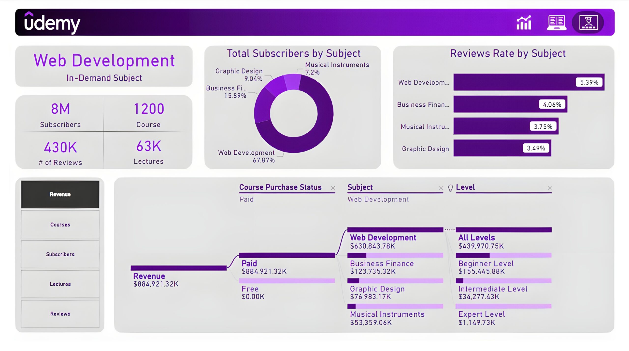
Subjects: The third and final report page provides deep insights into the course subject. Cards to display in-demand subject, its subscribers, its courses, its reviews, and its lectures. A donut chart shows total subscribers by subject and a bar chart shows the review rate by subject. Lastly, a decomposition tree chart is used to analyze measures such as revenue, course subscribers, lectures, and reviews by course purchase status, subjects, and levels.
EV Sales Analysis (Power BI)
The Situation:
EV Sales Analysis is a fictional collection of data related to its sales across various states of India. It encompasses multiple attributes, such as electric vehicle sales, vehicle category, makers, state, etc. Our goal is to transform their raw data into meaningful insights and recommendations for management. More specifically, we need to:
- Track KPIs (electric vehicle sales, total vehicles sales, penetration rate, average EV sales)
- Compare state-level performance
- Identify high-value makers and vehicle category
The Data:
We’ve been given a collection of raw data (CSV files), which contains information about electric vehicles sold, total vehicles sold, state, maker, vehicle category, sales date, and fiscal year in three tables from 2021-24.
The Task:
We are tasked with using solely Microsoft Power BI to:
- Connect and transform/shape the data in Power BI’s back-end using Power Query
- Build a relational data model, linking the 4 fact and dimension tables
- Create calculated columns and measures with DAX
- Design a multi-page interactive dashboard to visualize the data in Power BI’s front-end
The Process:
1. Connecting and Shaping the Data
Firstly, we imported the data into the Power Query editor to transform and clean it. The process involved:
Data Type Conversion: Columns were converted to appropriate data types to ensure consistency. Dates were converted to Date type, numerical columns to Decimal or Whole Numbers, and text columns to Text.
Standardizing Date Formats: All date columns were formatted consistently to facilitate time-based analysis. This step was important for ensuring accurate time-series analysis in Power BI.
Date Component Extraction: Extracted the month from date entries to enhance time-based analysis.
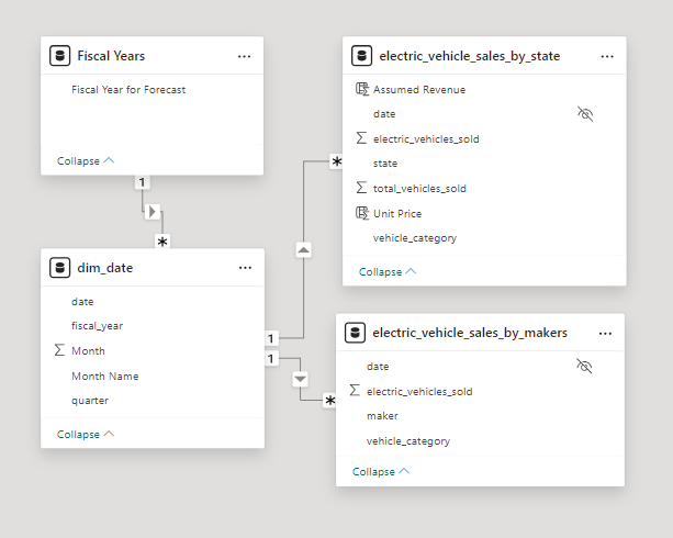
2. Building a Relational Data Model
Secondly, we modeled the data to create a snowflake schema. This process involved creating relationships between the dimension and fact tables, ensuring cardinalities were one-to-many relationships.
We enabled active or inactive relationships, created hierarchies for fields such as Date (Fiscal Year-Quarter-Month), and finally hid the foreign keys from the report view to ease the data analysis and visualization steps and reduce errors.
3. Creating Calculated Columns and Measures
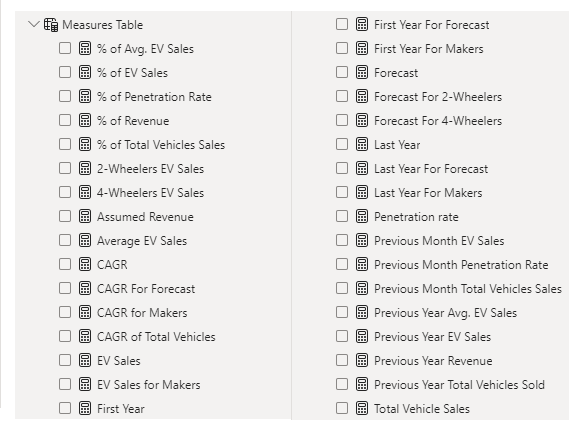
Next, we used Power BI’s front-end formula language, DAX, to analyze our relational data model and create several calculated columns (for filtering) and measures (for aggregation) that we could later reference and use when analyzing and visualizing the data.
We used calculated columns to determine assumed revenue. The list of calculated measures includes key information on EV sales, penetration rate, CAGR, total vehicle sales, and more.
4. Visualizing the Data
The final step of the project was creating a multi-page interactive dashboard, including a range of visuals and KPIs that could serve management and lead to informed decision-making. We used several visuals and tools to demonstrate and visualize the data across 3 report pages, including KPI cards, column, line and bar charts, matrices, funnel, slicers, and maps. We ensured the report was fully interactive and simple to navigate, with icons used to enable filters, cancel filters, and guide users to each report page with ease. Features such as drill-through and bookmarks were also used throughout the dashboard, further enhancing its usefulness and impact on management.
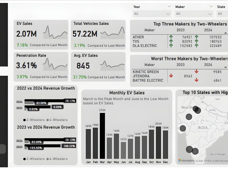
Overview Dashboard: The first report page provides a high-level view of overall performance. We used card visuals to present Key Performance Indicators such as electric vehicle sales, total vehicle sales, penetration rate, and average electric vehicle sales, with each KPI displaying monthly trends and last month’s performance. We included two matrices to display the top three and worst three makers by two-wheelers sold in the year 2023 and 2024, two clustered bar charts to compare the revenue growth rate of 2022 vs 2024 and 2023 vs 2024, a column chart to show monthly EV sales, and a map chart to display top 10 states with highest CAGR in total vehicles sold.
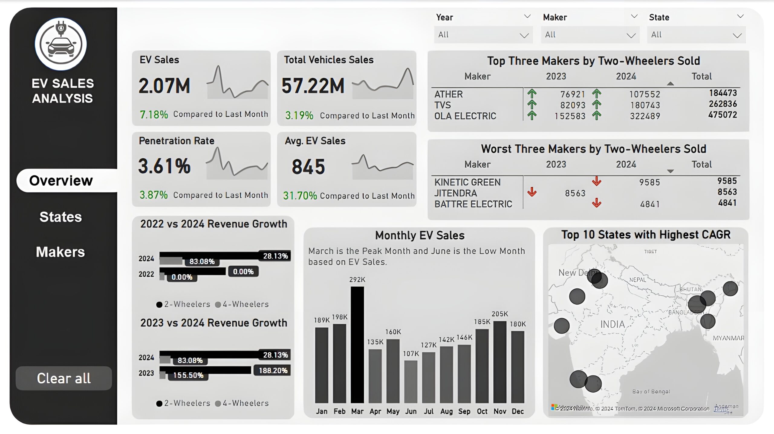
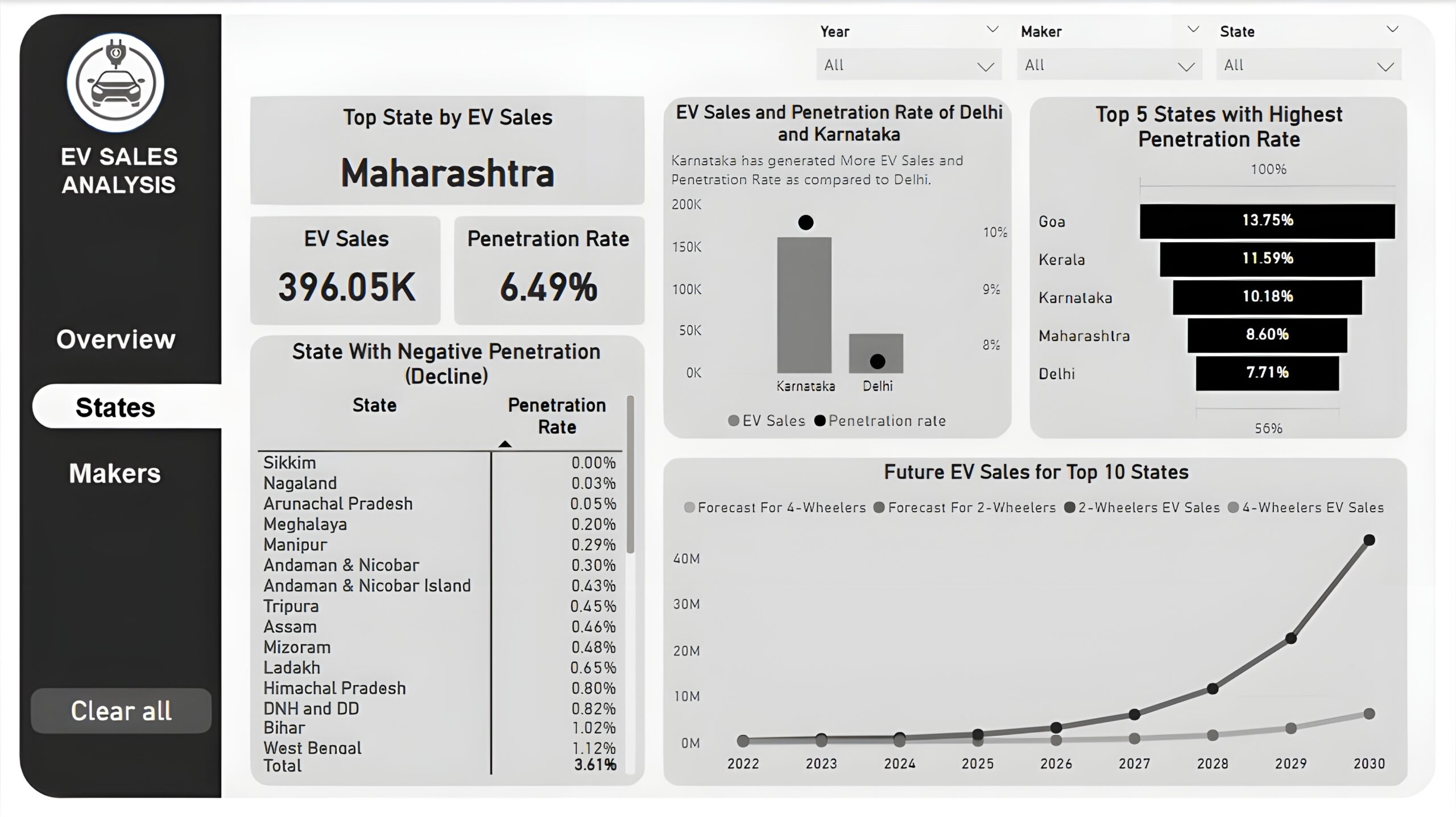
States : The second report page is a destination page by states to further analyze the performance in a specific state. It consists of KPI cards to display the top state, its EV sales, and its penetration rate. A line and column chart is used to compare EV sales and penetration rate between Delhi and Karnataka, a funnel chart to show the top 5 states with the highest penetration rate, a matrix chart to display states with negative penetration rates, and a line chart to display forecasting for ev sales of top 10 states from 2022 till 2030.
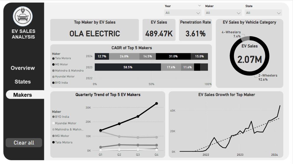
Makers: The third and final report page provides a more detailed analysis of makers. It consists of cards that display the top EV maker, its total EV sales and penetration rate, a 100% stacked bar chart to show the CAGR of the top 5 makers from 2022 to 2024, a donut chart to display EV sales by vehicle category, a line chart to show ev sales trend of top 5 makers by quarters, and another line chart to visualize ev sales growth of top maker.
Coffee Brand Review Analysis (Power BI)
The Situation:
Coffee Brand Review Analysis is a collection of data related to its reviews on various coffees of different origins and roasts. It encompasses various attributes, such as brand name, roasters, origin, price, rating, etc. Our goal is to transform their raw data into meaningful insights and recommendations for management. More specifically, we need to:
- Track KPIs (total coffee brands, total origin, highest rating, average rating)
- Compare coffee origin and roaster location performance
- Analyze relationship between coffee price and rating
- Identify customer preference and brand performance
The Data:
We’ve been given a collection of raw data (CSV file), which contains information about coffee brand name, roasters, roaster location, origin, rating, price per 100 bag in USD and more, in a total of a single table, from the years 2017-22.
The Task:
We are tasked with using solely Microsoft Power BI to:
- Connect and transform/shape the data in Power BI’s back-end using Power Query
- Build a relational data model, linking the 2 fact and dimension tables
- Create calculated columns and measures with DAX
- Design a multi-page interactive dashboard to visualize the data in Power BI’s front-end
The Process:
1. Connecting and Shaping the Data
Firstly, we imported the data into the Power Query editor to transform and clean it. The process involved:
Handling Null or Missing Values: For some columns, missing values were replaced with defaults or averages. Null values in “Type of Roast”, “Aroma” and “Mouthfeel” columns were removed using filters.
Data Type Conversion: Columns were converted to appropriate data types to ensure consistency. Dates were converted to Date type, numerical columns to Decimal or Whole Numbers, and text columns to Text.
Standardizing Date Formats: All date columns were formatted consistently to facilitate time-based analysis. This step was important for ensuring accurate time-series analysis in Power BI.
2. Building a Relational Data Model
Secondly, we modeled the data to create a snowflake schema. This process involved creating relationships between the dimension and fact tables, ensuring cardinalities were one-to-many relationships.
We enabled active or inactive relationships and hid the foreign keys from the report view to ease the data analysis and visualization steps and reduce errors.
3. Creating Calculated Columns and Measures
Next, we used Power BI’s front-end formula language, DAX, to analyze our relational data model and create several calculated columns (for filtering) and measures (for aggregation) that we could later reference and use when analyzing and visualizing the data. The list of calculated measures includes key information on number of coffee brands, number of origins, average rating, average rating per coffee, coffee with 90+ ratings, coffee brand rank and highest rating.
4. Visualizing the Data
The final step of the project was creating a multi-page interactive dashboard, including a range of visuals and KPIs that could serve management and lead to informed decision-making. We used several visuals and tools to demonstrate and visualize the data across 3 report pages, including KPI cards, line, column and bar charts, matrices, scatter chart, donut chart, and maps. We ensured the report was fully interactive and simple to navigate, with icons used to enable filters, cancel filters, and guide users to each report page with ease. Features such as drill-through, bookmarks, and parameters were also used throughout the dashboard, further enhancing its usefulness and impact on management.
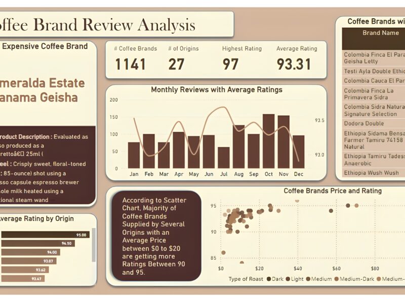
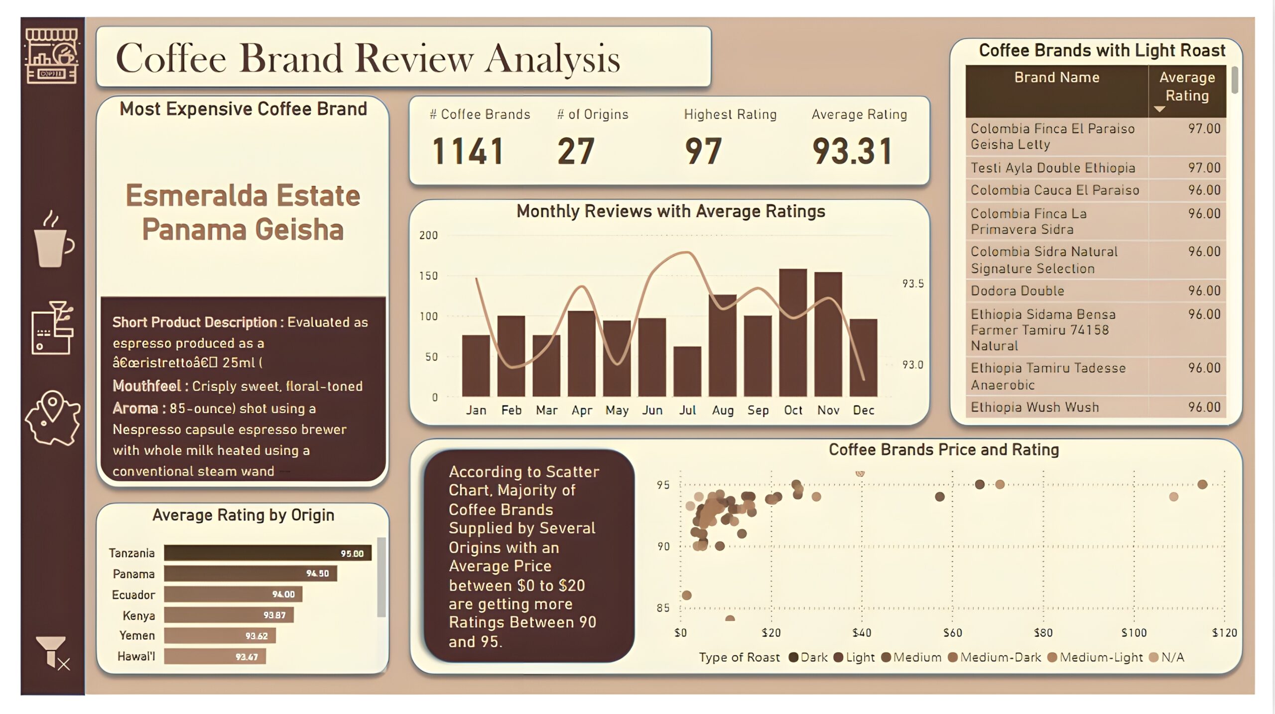
Overview Dashboard: The first report page provides a high-level view of overall performance. We used card visuals to present Key Performance Indicators such as number of coffee brands, number of origins, highest rating, and average rating. We also included additional card to present the most expensive coffee brand including its short product description, mouthfeel and aroma, a line and column chart to display monthly reviews with average ratings, a bar chart to show top 10 origins with average rating, a matrix that displays coffee brands with light roast, and a scatter chart to show relationship between coffee price and ratings.
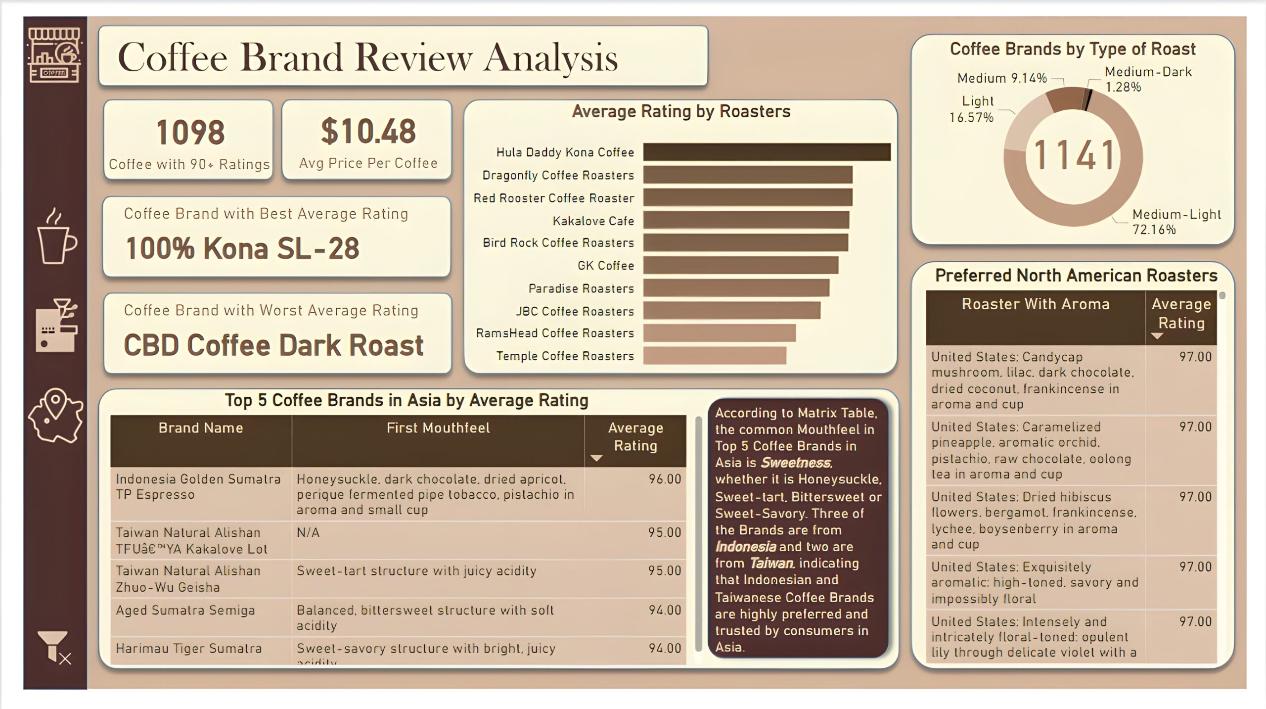
Brand and Roaster Performance: The second report page focuses on brand and roaster analysis. It displays information such as number of coffees with 90+ ratings, average price per coffee and names of coffee brands with best and worst average rating, a clustered bar chart to visualize average rating by roasters, a donut chart to display coffee brands by types of roasts, a matrix that shows the top 5 brand names in Asia by average rating, including mouthfeel and average rating of those brands, and another matrix chart that displays preferred coffee roasters of North America with their aroma and average rating.
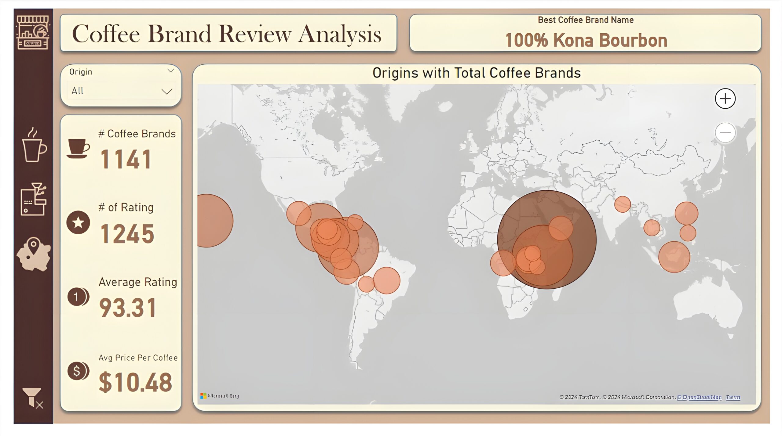
Coffee Origin: The third and last report page is a drill-through page by coffee origin to further analyze the performance in a specific origin. We have included a slicer that allows user to filter and view data based on any coffee origin throughout the entire report. The report consists of a card that displays best coffee brand name of each origin. Additional cards are used to show number of coffee brands, number of rating, average rating, and average price per coffee. And a map chart that visualizes origins with most number of coffee brands.
E-commerce KPI Analysis (Power BI)
The Situation:
E-commerce KPI Analysis is a collection of data related to its sales across multiple countries around the world. It encompasses various attributes, such as orders, sales, products, market, etc. Our goal is to transform their raw data into meaningful insights and recommendations for management. More specifically, we need to:
- Track KPIs (orders, sales, profit, quantity, profit margin)
- Compare regional and state-level performance
- Identify product effectiveness and customer behavior
The Data:
We’ve been given a collection of raw data (CSV files), which contains information about orders, quantity, sales, discount, products, categories, customers, segments, regions, markets and others, in a total of a single table, from the years 2020-23.
The Task:
We are tasked with using solely Microsoft Power BI to:
- Connect and transform/shape the data in Power BI’s back-end using Power Query
- Build a relational data model, linking the 2 fact and dimension tables
- Create calculated columns and measures with DAX
- Design a multi-page interactive dashboard to visualize the data in Power BI’s front-end
The Process:
1. Connecting and Shaping the Data
Firstly, we imported the data into the Power Query editor to transform and clean it. The process involved:
Removing Duplicates: Duplicate entries were removed from the dataset to ensure accurate analysis.
Data Type Conversion: Columns were converted to appropriate data types to ensure consistency. Dates were converted to Date type, numerical columns to Decimal or Whole Numbers, and text columns to Text.
Standardizing Date Formats: All date columns were formatted consistently to facilitate time-based analysis. This step was important for ensuring accurate time-series analysis in Power BI.
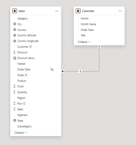
2. Building a Relational Data Model
Secondly, we modeled the data to create a snowflake schema. This process involved creating relationships between the dimension and fact tables, ensuring cardinalities were one-to-many relationships.
We enabled active or inactive relationships, created hierarchies for fields such as Geography (City-State-Country-Region) and finally hid the foreign keys from the report view to ease the data analysis and visualization steps and reduce errors.
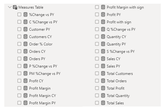
3. Creating Calculated Columns and Measures
Next, we used Power BI’s front-end formula language, DAX, to analyze our relational data model and create several calculated columns (for filtering) and measures (for aggregation) that we could later reference and use when analyzing and visualizing the data.
We used calculated columns to categorize discount into defined groups. The list of calculated measures includes key information on sales, customers, orders, profit, quantity, and more.
4. Visualizing the Data
The final step of the project was creating a multi-page interactive dashboard, including a range of visuals and KPIs that could serve management and lead to informed decision-making. We used several visuals and tools to demonstrate and visualize the data across 3 report pages, including KPI cards, line, column and bar charts, matrices, donut charts, slicers, and maps. We ensured the report was fully interactive and simple to navigate, with icons used to enable filters, cancel filters, and guide users to each report page with ease. Features such as bookmarks and parameters were also used throughout the dashboard, further enhancing its usefulness and impact on management.
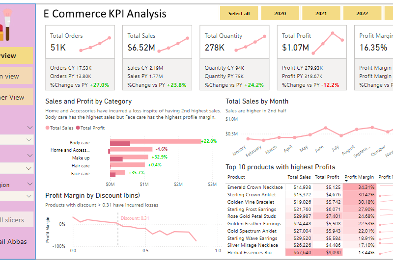
Overview Dashboard: The first report page provides a high-level view of overall performance. We used card visuals to present Key Performance Indicators such as overall sales, number of orders, quantity sold, profit and profit margin. We also included current and previous year performances of those matrices, providing insights into recent trends, a clustered bar chart to show sales and profit by product category, a line chart to display sales monthly trends, another line chart to show profit margin by discount segments, and a matrix to display the top 10 products with their overall sales, profit, profit margin profit margin by year.
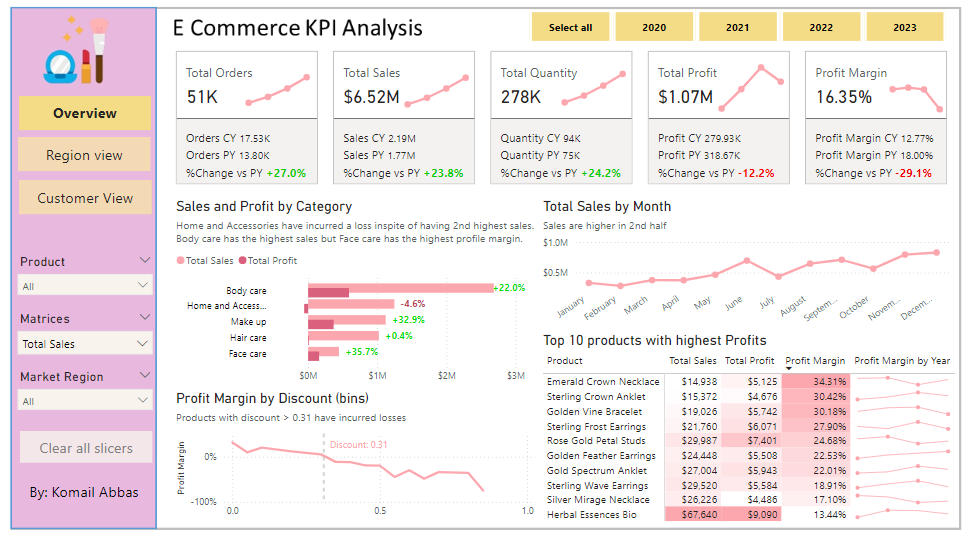
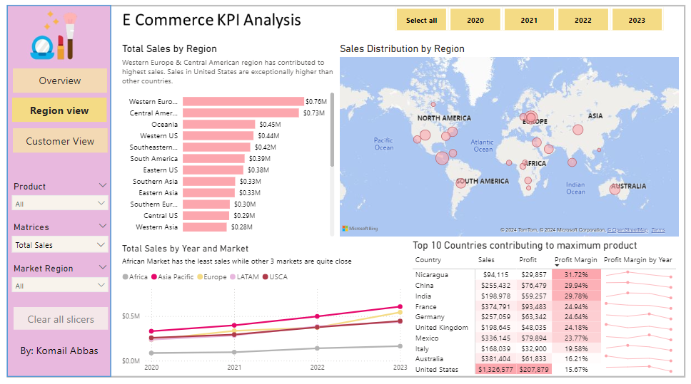
Region View: The second report page is a regional overview page to further analyze the performance in a specific region. It consists of a clustered bar chart that shows sales by regions, a map chart to display sales distribution by regions, a line chart to visualize yearly sales of markets, and a matrix chart that displays top 10 countries with their sales, profit, profit margin and profit margin by year. This offers insight into sales distribution by region.
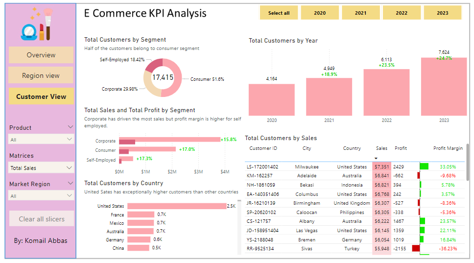
Customer View: The third and final report page provides deeper insight into customer behavior and value. It uses a donut chart to show total customers by segments, a column chart to show total customers by year, a clustered bar chart to display total sales and profit generated by segments, one more bar chart to show total customers by country, and a matrix to present customer’s purchase details, including city and country of order, sales, generated profit and profit margin.
Marketing Campaign Analysis (Power BI)
The Situation:
The Marketing Campaign Analysis dataset is provided by a UK-based clothing retailer, containing data on sales performance throughout the United Kingdom. It includes details such as revenue, campaigns, devices, channels, and more. Our goal is to transform this raw data into insightful recommendations for management. Specifically, we aim to:
- Monitor key performance indicators (KPIs) like revenue, profit, clicks, and customer ratings.
- Evaluate campaign performance across cities, channels, devices, and individual advertisements.
The Data:
We received CSV files containing information on campaigns, channels, devices, clicks, conversions, impressions, ads, and location in a single table, covering the period from March 2023 to November 2023.
The Task:
We are tasked with employing solely Microsoft Power BI to:
- Connect and transform/shape the data using Power Query.
- Construct a relational data model linking fact and dimension tables.
- Create calculated columns and measures using DAX.
- Design a multi-page interactive dashboard to visualize the data.
The Process:
1. Connecting and Shaping the Data
Firstly, we imported the data into the Power Query editor for transformation and cleaning. This process involved:
Removing Duplicates: Duplicate entries were eliminated from the dataset to ensure accurate analysis.
Data Type Conversion: Columns were adjusted to appropriate data types for consistency. Dates were converted to Date type, numerical columns to Decimal or Whole Numbers, and text columns to Text.
Standardizing Date Formats: All date columns were formatted uniformly to facilitate time-based analysis, a crucial step for ensuring accurate time-series analysis in Power BI.
Removing Unnecessary Columns: Irrelevant columns were discarded to streamline the dataset. This helped focus the analysis on essential information, reducing memory usage and enhancing performance.
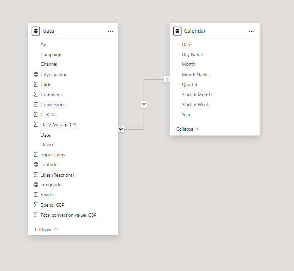
2. Building a Relational Data Model
Secondly, we modeled the data to create a snowflake schema. This process involved establishing relationships between the dimension and fact tables, ensuring cardinalities were set to one-to-many relationships.
We hid the foreign keys from the report view to simplify data analysis and visualization steps and minimize errors.
3. Creating Calculated Columns and Measures
Next, we utilized Power BI’s front-end formula language, DAX, to analyze our relational data model and produce several calculated columns (for filtering) and measures (for aggregation) for later reference when analyzing and visualizing the data.
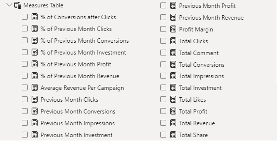
The list of calculated measures includes key information on revenue, profit, impressions, clicks, conversions, investment, and more.
4. Visualizing the Data
The final step of the project was the creation of a multi-page interactive dashboard, featuring a variety of visuals and KPIs that could assist management and facilitate informed decision-making. We employed several visuals and tools across 3 report pages, including KPI cards, line, column and bar charts, matrices, donut charts, tree maps, and map charts. We ensured the report was fully interactive and easy to navigate, incorporating icons to enable filters, remove filters, and guide users to each report page with ease. Features such as parameters and navigation buttons were also included throughout the dashboard, further enhancing its utility and impact on management..
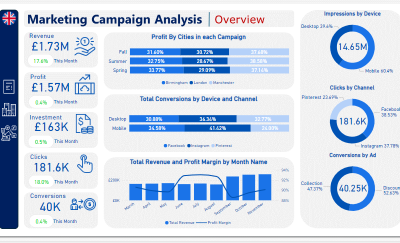
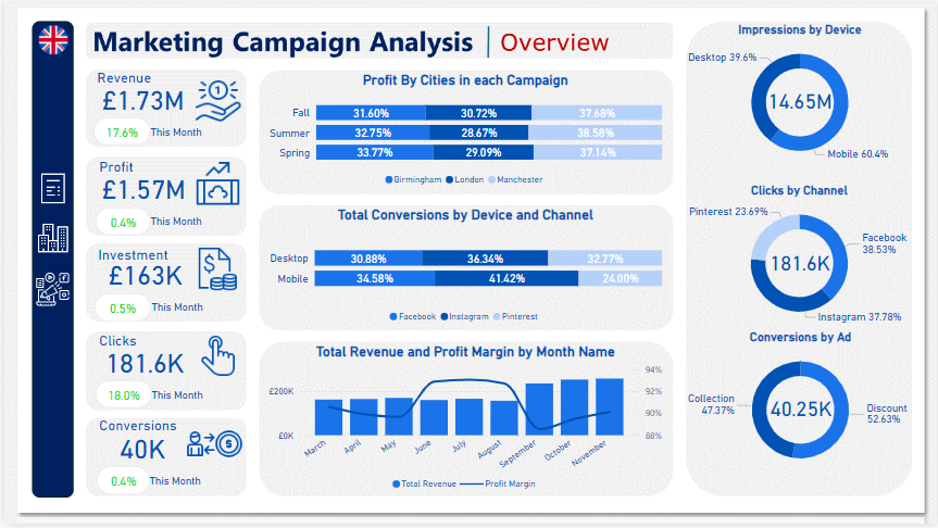
Overview Dashboard: The first report page provides a high-level view of the overall performance of Marketing Campaigns. We used card visuals to present Key Performance Indicators such as total revenue, profit, investment, clicks, and conversions. Additionally, we included two 100% stacked bar charts: the first to analyze the distribution of profit generated by cities in each campaign, and the second to observe the distribution of conversions achieved from various channels on each device. A line and stacked column chart was also included to compare revenue and profit margins by month, along with three donut charts to showcase total impressions by devices, clicks by channels, and conversions by ads, each donut chart also displaying the total of matrices.
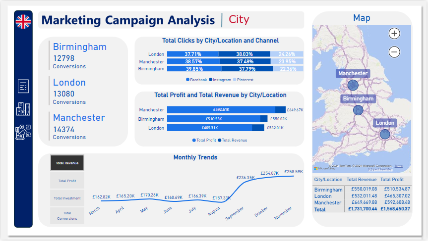
City: The second report page acts as a navigation page by city to further analyze performance in specific locations. It consists of cards illustrating the number of conversions in each city, a 100% stacked bar chart that displays the percentage of total clicks tracked on each channel across different cities, a clustered bar chart revealing the revenue and profit generated in each city, a map chart displaying total revenue by city, and a matrix chart showing revenue and profit by city. A line chart with matrices slicer visualizes the trending revenue, profit, investment, and conversions from March 2023 to November 2023, highlighting long-term performance. This provides insights into Oodles of Noodles’ sales distribution by city.
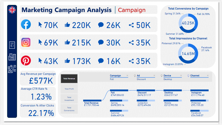
Campaign: The third and final report page focuses on detailed campaign performance. It includes cards displaying total clicks, likes, comments, and shares by channel, as well as additional cards showing average revenue per campaign, average CTR rate percentage, and conversion rates after clicks. Two donut charts illustrate conversions by campaign and impressions by channels, each displaying total matrix values. Additionally, a decomposition tree was employed to analyze the breakdown of total revenue, profit, investment, and conversion into various categories, including campaigns, ads, devices, and channels.
CRM and Sales Pipelines (Power BI)
The Situation:
CRM is a collection of data related to its sales across multiple countries. It encompasses various attributes, such as total leads, conversion rate, total deal value, etc. Our goal is to transform their raw data into meaningful insights and recommendations for management. More specifically, we need to:
- Track KPIs (total leads, total deal value, leads closed, closed deal value, conversion rate, lost rate.)
- Provide insights into lead distribution across countries, industries, and organization sizes.
- Identify the health of the sales pipeline, forecast potential income over the next few months, and compare sales agent performance.
The Data:
We’ve been given a collection of raw data (CSV file), which contains information about organizations, industries, country, product, lead acquisition date, expected and closed date, and deal value, in a total of 1 table, from January 2024 to September 2024.
The Task:
We are tasked with using solely Microsoft Power BI to:
- Connect and transform/shape the data in Power BI’s back-end using Power Query
- Build a relational data model, linking the 5 fact and dimension tables
- Create calculated columns and measures with DAX
- Design a multi-page interactive dashboard to visualize the data in Power BI’s front-end
The Process:
1. Connecting and Shaping the Data
Firstly, we imported the data into the Power Query editor to transform and clean it. The process involved:
Removing Duplicates: Duplicate entries were removed from the dataset to ensure accurate analysis.
Handling Null or Missing Values: For some columns, missing values were replaced with defaults or averages. Null values in “key” columns were removed using filters.
Data Type Conversion: Columns were converted to appropriate data types to ensure consistency. Dates were converted to Date type, numerical columns to Decimal or Whole Numbers, and text columns to Text.
Column Splitting and Merging: Several columns were split to separate concatenated information or merged to create a unified name.
Standardizing Date Formats: All date columns were formatted consistently to facilitate time-based analysis. This step was important for ensuring accurate time-series analysis in Power BI.
Removing Unnecessary Columns: Irrelevant columns were removed to streamline the dataset. This helped focus the analysis on relevant information, reducing memory usage and improving performance
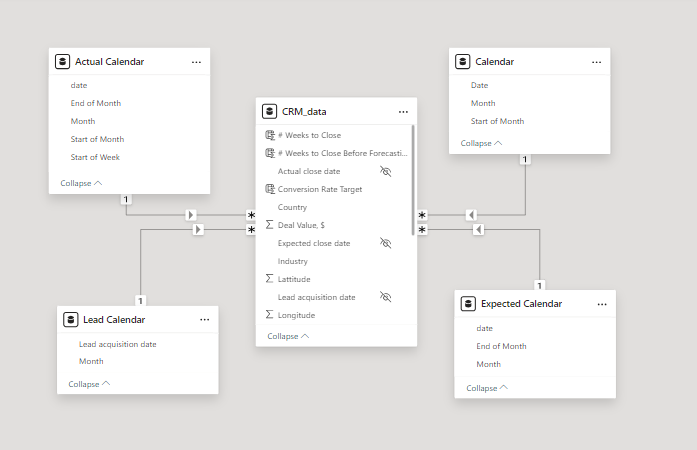
2. Building a Relational Data Model
Secondly, we modeled the data to create a star schema. This process involved creating relationships between the dimension and fact tables, ensuring cardinalities were one-to-many relationships.
We enabled active or inactive relationships, created hierarchies for fields such as Date (Month-End of Month-Start of Month-Start of Week), and finally hid the foreign keys from the report view to ease the data analysis and visualization steps and reduce errors.
3. Creating Calculated Columns and Measures
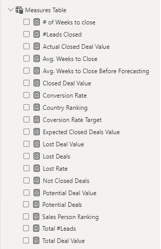
Next, we used Power BI’s front-end formula language, DAX, to analyze our relational data model and create several calculated columns (for filtering) and measures (for aggregation) that we could later reference and use when analyzing and visualizing the data.
The list of calculated measures includes avg. weeks to close, # of leads closed, lost deal value, sales person ranking and more.
4. Visualizing the Data
The final step of the project was creating a multi-page interactive dashboard, including a range of visuals and KPIs that could serve management and lead to informed decision-making. We used several visuals and tools to demonstrate and visualize the data across 2 report pages, including KPI cards, line and column charts, matrices, bar charts, and pie charts. We ensured the report was fully interactive, with slicers used to enable filters, and allow users to each report page with ease. Features such as parameters were also used throughout the dashboard, further enhancing its usefulness and impact on management.
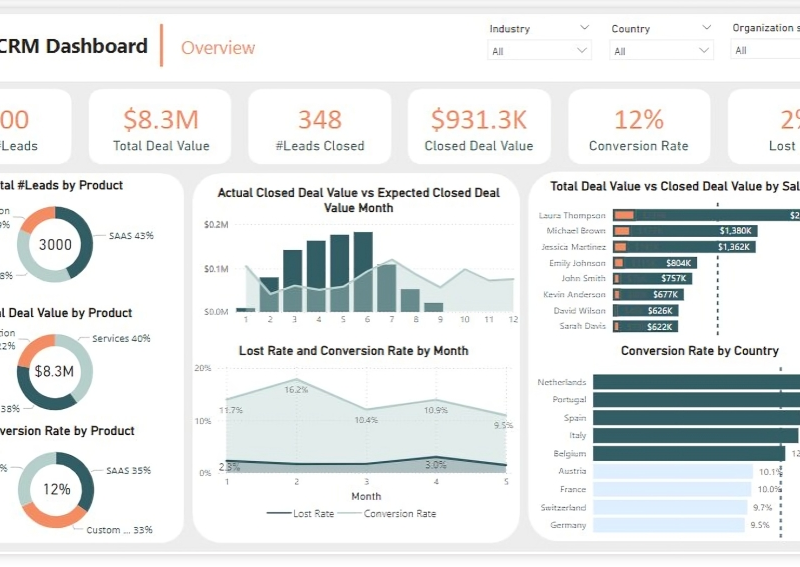
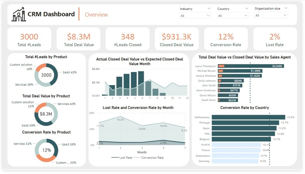
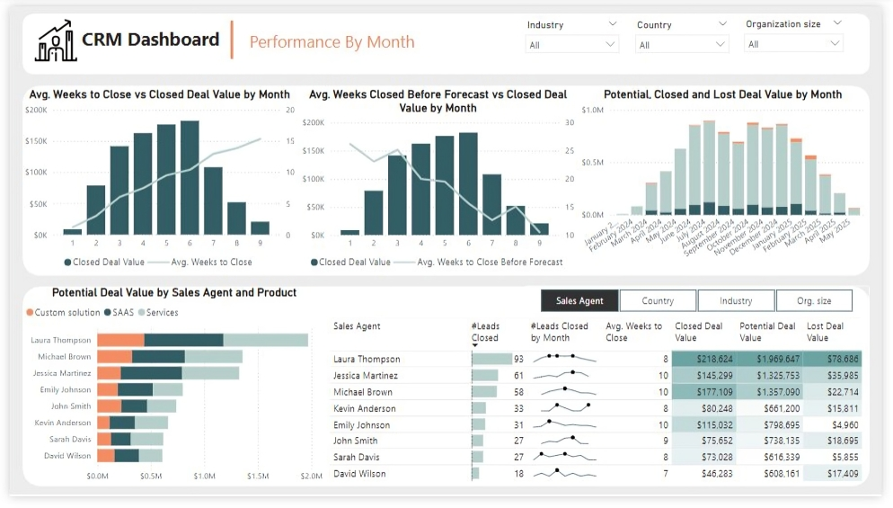
Overview Dashboard: The first report page provides a high-level view of CRM’s overview. We used card visuals to present Key Performance Indicators such as Total Leads, Total Deal Value, # Leads Closed, Closed Deal Value, Conversion Rate and Lost Rate. We also included pie charts to show distribution of total leads, total deal value and conversion rate between products, a line chart to represent monthly lost rate and conversion rate, a line and clustered column chart to compare actual closed deal value and expected closed deal value by month, a clustered bar chart to show comparison between total deal value and closed deal value by sales agent, and a clustered bar chart to display conversion rate by country.
Performance by Month: The second report page is to further analyze the sales agent performance and monthly distribution of closed, expected and potential deal values. It consists of a line and clustered column chart that shows average weeks to close vs closed deal value by month, second line and clustered column chart to display average weeks closed before forecast vs closed deal value by month, a stacked column chart to show potential, closed and lost deal value from January to September 2024, a stacked column chart to display distribution of potential deal value by sales agent and product, and a matrix that visualizes performance of salespersons, countries, industries and organization size in closed leads, average weeks, and closed, potential and lost deal values, with addition of spark lines to display their monthly closed leads.
Oodles of Noodles (Power BI)
The Situation:
Oodles of Noodles is a fictional collection of data related to its sales across the United States. It encompasses various attributes, such as revenue, customer preferences, shipment time, etc. Our goal is to transform their raw data into meaningful insights and recommendations for management. More specifically, we need to:
- Track KPIs (revenue, meal kits sold, shipments, customer rating)
- Compare regional and state-level performance
- Identify high-value subscription plans and cuisine types
The Data:
We’ve been given a collection of raw data (CSV files), which contains information about shipments, returns, meal kits, customers, sales territories, and reviews, in a total of 9 tables, from the years 2020-21.
The Task:
We are tasked with using solely Microsoft Power BI to:
- Connect and transform/shape the data in Power BI’s back-end using Power Query
- Build a relational data model, linking the 9 fact and dimension tables
- Create calculated columns and measures with DAX
- Design a multi-page interactive dashboard to visualize the data in Power BI’s front-end
The Process:
1. Connecting and Shaping the Data
Firstly, we imported the data into the Power Query editor to transform and clean it. The process involved:
Removing Duplicates: Duplicate entries were removed from the dataset to ensure accurate analysis.
Handling Null or Missing Values: For some columns, missing values were replaced with defaults or averages. Null values in “key” columns were removed using filters.
Data Type Conversion: Columns were converted to appropriate data types to ensure consistency. Dates were converted to Date type, numerical columns to Decimal or Whole Numbers, and text columns to Text.
Column Splitting and Merging: Several columns were split to separate concatenated information or merged to create a unified name (such as Customer Full Name).
Standardizing Date Formats: All date columns were formatted consistently to facilitate time-based analysis. This step was important for ensuring accurate time-series analysis in Power BI.
Removing Unnecessary Columns: Irrelevant columns were removed to streamline the dataset. This helped focus the analysis on relevant information, reducing memory usage and improving performance.
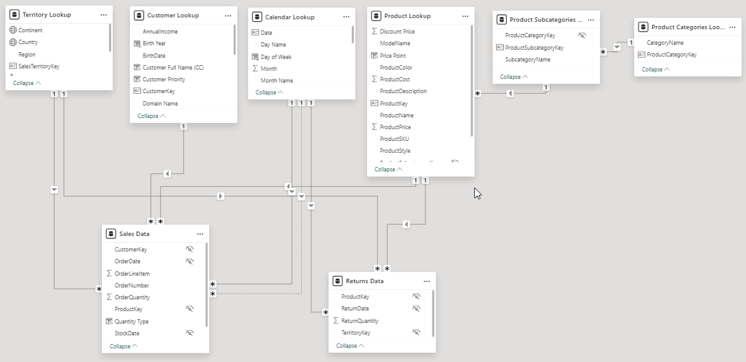
2. Building a Relational Data Model
Secondly, we modeled the data to create a snowflake schema. This process involved creating relationships between the dimension and fact tables, ensuring cardinalities were one-to-many relationships.
We enabled active or inactive relationships, creating hierarchies for fields such as Geography (Continent-Country-Region) and Date (Start of Year-Start of Month-Start of Week-Date), and finally hid the foreign keys from the report view to ease the data analysis and visualization steps and reduce errors.
3. Creating Calculated Columns and Measures
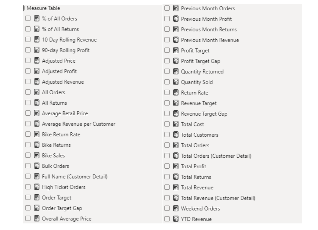
Next, we used Power BI’s front-end formula language, DAX, to analyze our relational data model and create several calculated columns (for filtering) and measures (for aggregation) that we could later reference and use when analyzing and visualizing the data.
We used calculated columns to determine whether a customer is active and a loyal member.
The list of calculated measures includes key information on revenue, total shipments, reviews, SLA, and more.
4. Visualizing the Data
The final step of the project was creating a multi-page interactive dashboard, including a range of visuals and KPIs that could serve management and lead to informed decision-making. We used several visuals and tools to demonstrate and visualize the data across 4 report pages, including KPI cards, line and bar charts, matrices, gauge charts, and tree maps. We ensured the report was fully interactive and simple to navigate, with icons used to enable filters, cancel filters, and guide users to each report page with ease. Features such as drill-through, bookmarks, parameters, and tooltips were also used throughout the dashboard, further enhancing its usefulness and impact on management.
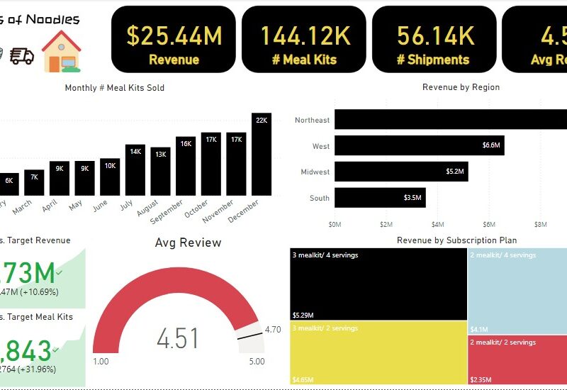
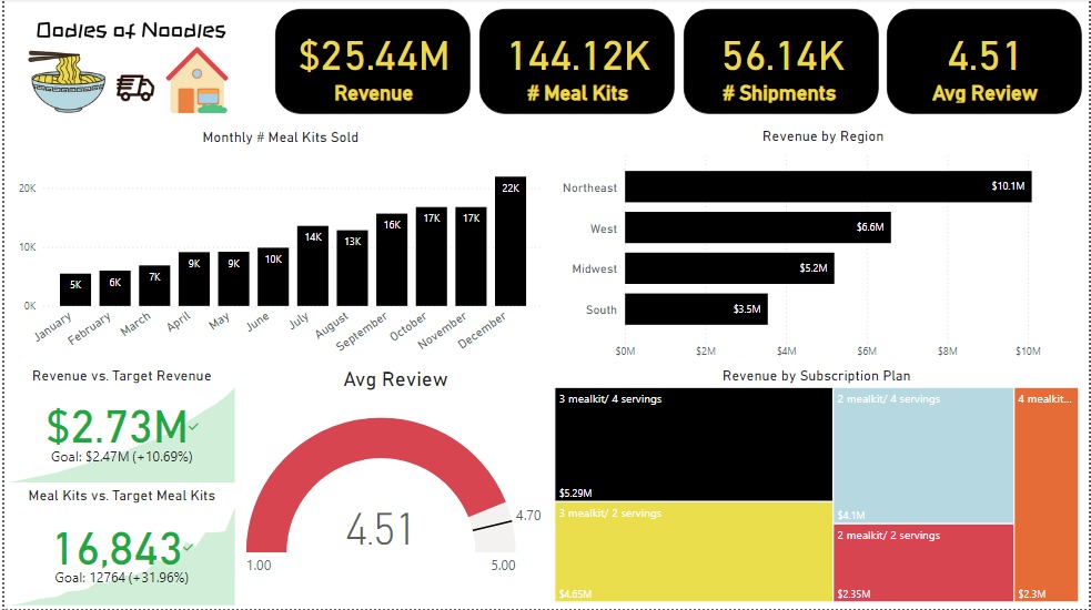
Executive Dashboard: The first report page presents an overview of Oodles of Noodles’ performance. We used card visuals for KPIs like revenue, meal kits sold, shipments, and average customer ratings. Additional cards compare current vs. previous month performance, showing trends, while a clustered bar chart displays revenue by region, a gauge chart shows average ratings, and a tree map highlights the top 5 subscription plans by revenue.
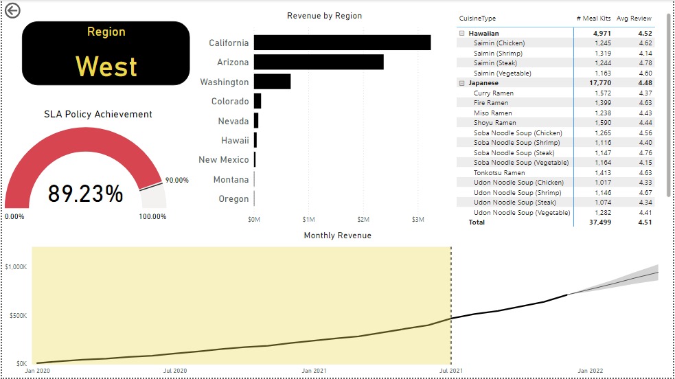
Region: The second report page is a drill-through by region for detailed performance analysis. It includes a bar chart for state-level revenue, a matrix showing cuisine types by meal kits sold and average ratings, a gauge chart for SLA policy adherence, and a line chart for revenue trends from 2020-2021. This page reveals Oodles of Noodles’ sales distribution by region and state.
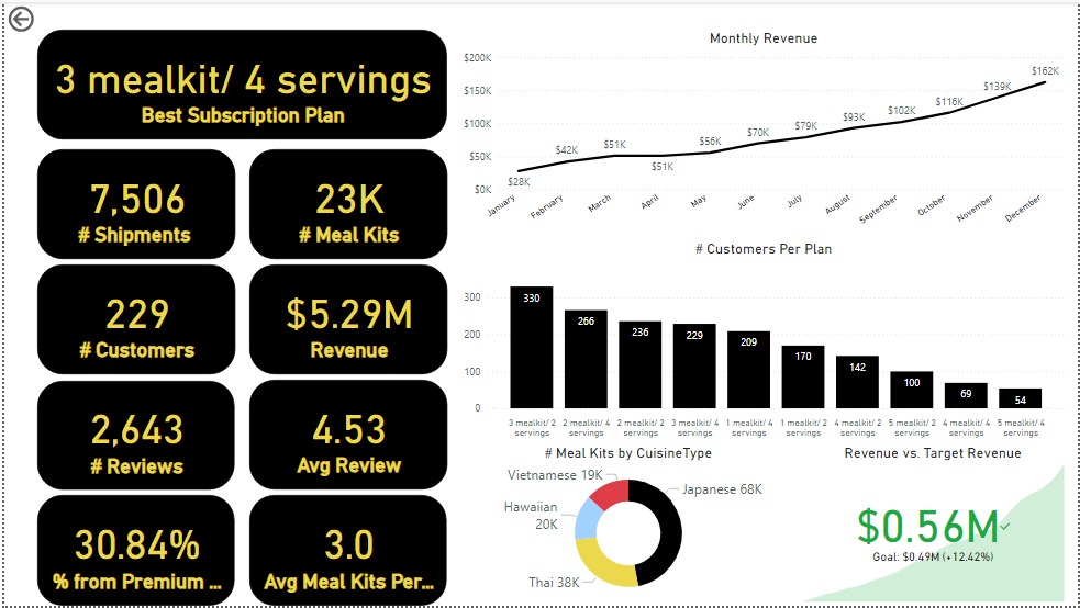
Subscription: The third report page dives into subscription-level analysis. It features a line chart of monthly revenue, cards showing the Best Subscription Plan with total shipments, meal kits, customers, revenue, reviews, average reviews per customer, premium plan percentage, and average meal kits per customer. Additionally, there’s a clustered column chart for customers per subscription plan, a donut chart for meal kits by cuisine, and a KPI card comparing current vs. previous month revenue.
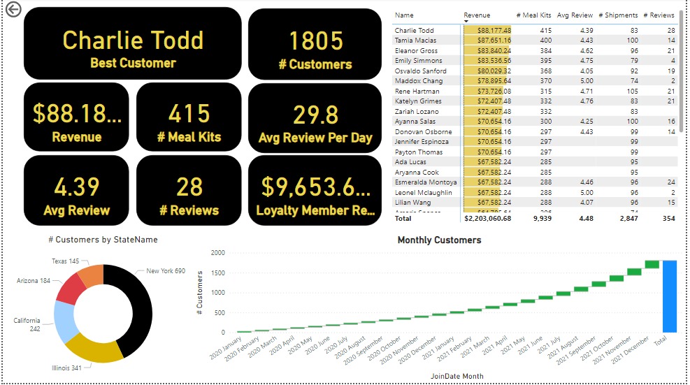
Customer Detail: The final report page provides deep insights into customer behavior. A donut chart shows total customers by state, a matrix lists meal kits, revenue, and reviews, and cards display total customers, average reviews per day, loyalty member revenue, the best customer’s revenue, reviews, average review, meal kits, average reviews, and shipments. Lastly, a waterfall chart shows Monthly Customers.