

365 Business Bank Analysis (Power BI)
The Situation:
365 Business Bank Analysis is a collection of data related to the sales of thousands of online courses related to business finance, graphic design, web development, and musical instruments. It encompasses various attributes, such as revenue, course name, duration, etc. Our goal is to transform their raw data into meaningful insights and recommendations for management. More specifically, we need to:
- Enhance customer segmentation and personalization.
- Optimize resource allocation and operational efficiency.
- Identify and mitigate potential risks and fraud.
- Drive strategic initiatives that foster growth and competitive advantage.
The Data:
We’ve been given a collection of raw data (CSV files), which contains information about course title, price, number of subscribers, subject, published timestamp, and more, in a single table, from the years 2022-24.
The Task:
We are tasked with using solely Microsoft Power BI to:
- Connect and transform/shape the data in Power BI’s back-end using Power Query
- Build a relational data model, linking the 6 fact and dimension tables
- Create calculated columns and measures with DAX
- Design a multi-page interactive dashboard to visualize the data in Power BI’s front-end
The Process:
1. Connecting and Shaping the Data
Firstly, we imported the data into the Power Query editor to transform and clean it. The process involved:
Removing Duplicates: Duplicate entries were removed from the dataset to ensure accurate analysis.
Handling Null or Missing Values: For some columns, missing values were replaced with defaults or averages. Null values in “key” columns were removed using filters.
Data Type Conversion: Columns were converted to appropriate data types to ensure consistency. Dates were converted to Date type, numerical columns to Decimal or Whole Numbers, and text columns to Text.
Standardising Date Formats: All date columns were formatted consistently to facilitate time-based analysis. This step was important for ensuring accurate time-series analysis in Power BI.
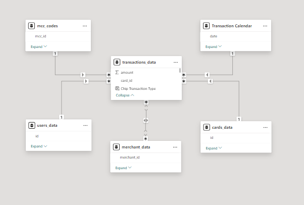
2. Building a Relational Data Model
Secondly, we modeled the data to create a snowflake schema. This process involved creating relationships between the dimension and fact tables, ensuring cardinalities were one-to-many relationships.
We enabled active or inactive relationships and hid the foreign keys from the report view to ease the data analysis and visualization steps and reduce errors.
3. Creating Calculated Columns and Measures
Next, we used Power BI’s front-end formula language, DAX, to analyze our relational data model and create several calculated columns (for filtering) and measures (for aggregation) that we could later reference and use when analyzing and visualizing the data.
We used calculated columns to determine whether a course is very cheap, cheap, moderate or expensive.
The list of calculated measures includes key information on total transactions, total customers, total merchants, average transaction value, and more.
4. Visualizing the Data
The final step of the project was creating a multi-page interactive dashboard, including a range of visuals and KPIs that could serve management and lead to informed decision-making. We used several visuals and tools to demonstrate and visualize the data across 4 report pages, including KPI cards, line, column, and bar charts, matrices, and donut charts. We ensured the report was fully interactive and simple to navigate, with icons used to enable filters, cancel filters, and guide users to each report page with ease. Features such as bookmarks and parameters were also used throughout the dashboard, further enhancing its usefulness and impact on management.
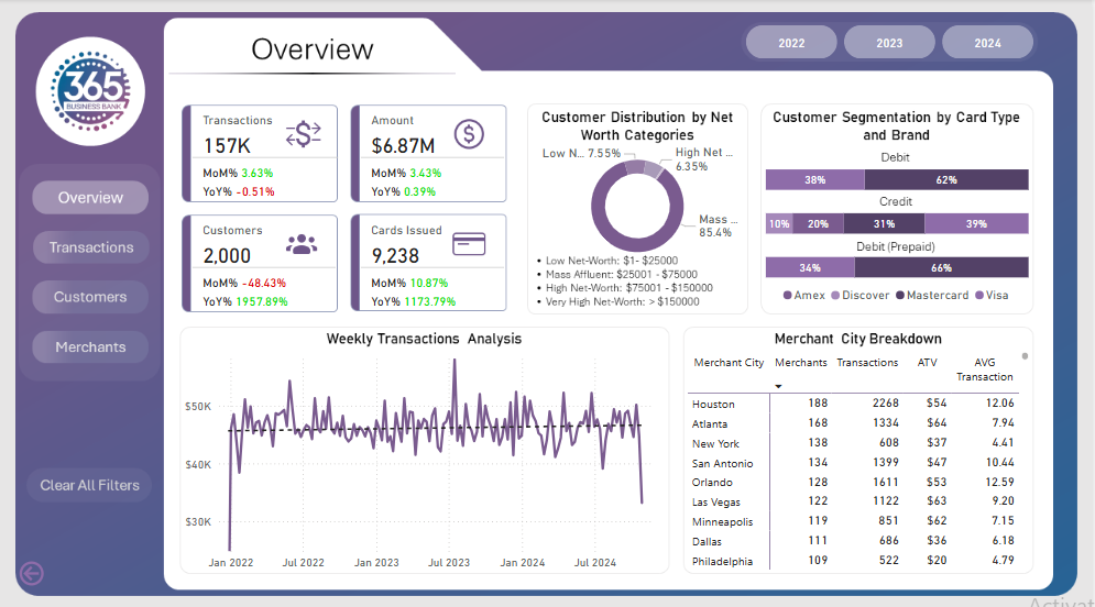
Overview Dashboard: The first report page presents an overview of overall performance. We used card visuals for KPIs like transactions, total amount, total customers, total cards issued to all customers. A 100% stacked bar chart is included to visualize the partition of card types in different card brands. We have used a donut chart, displaying the customer distribution by net worth category. A line chart is to show the weekly transactions and a matrix chart to show the merchant city breakdown.
Transactions: The second report page dives into transactional analysis. It consists of cards to present the total errors, error rate %, and most common error. Additionally, a dynamic scatter chart is included to show the transactions, spent amount, and errors by total customers and their credit score. Two donut chart to show total transactions by chip type and card ownership respectively, a line chart to display weekly error detection during transactions, and a column and line chart to present the distribution of transactions and ATV trends by months.
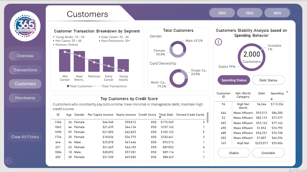
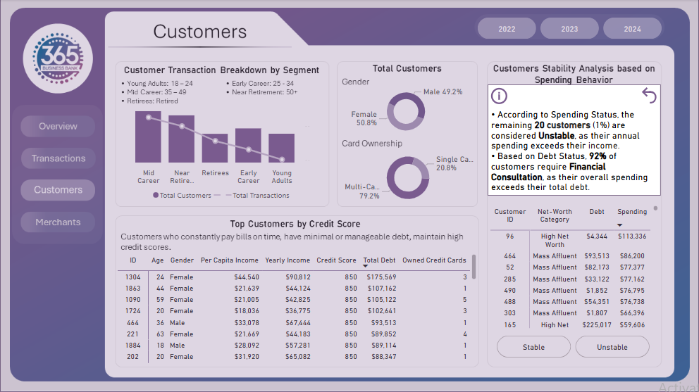
Customers: The third report page provides deep insights into the customer behavior. A column and line to display customer transaction breakdown by age segment. Two donut charts to show total customers by gender and card ownership, a matrix chart shows the distribution of top customers (based on credit score) in age, gender, per capita income, yearly income, credit score total debt and owner credit cards. Lastly, a dynamic combination of a donut and a matrix chart is used to analyze the stability of customers through their spending behavior, donut to show stable and unstable customers and matrix to show their net-worth category, debt and spending.
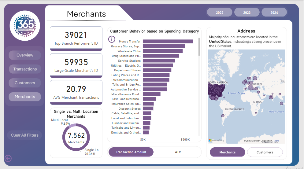
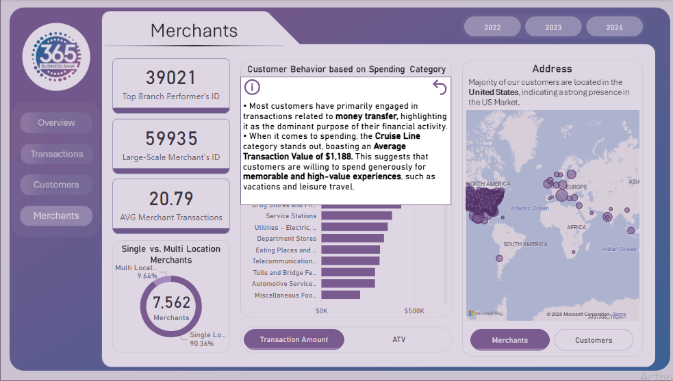
Merchants Dashboard: The fourth and final report page displays the overall performance by our merchants. We used card visuals to show top branch performer’s id, large scale merchant’s id and average merchant transactions. A pie chart is included to visualize the partition of merchants in single and multiple location category. A dynamic bar chart to display customers’ total transactions and average transactions based on the spending category. A map chart to display the address of merchants and customers with their transaction value.