

Coffee Brand Review Analysis (Power BI)
The Situation:
Coffee Brand Review Analysis is a collection of data related to its reviews on various coffees of different origins and roasts. It encompasses various attributes, such as brand name, roasters, origin, price, rating, etc. Our goal is to transform their raw data into meaningful insights and recommendations for management. More specifically, we need to:
- Track KPIs (total coffee brands, total origin, highest rating, average rating)
- Compare coffee origin and roaster location performance
- Analyze relationship between coffee price and rating
- Identify customer preference and brand performance
The Data:
We’ve been given a collection of raw data (CSV file), which contains information about coffee brand name, roasters, roaster location, origin, rating, price per 100 bag in USD and more, in a total of a single table, from the years 2017-22.
The Task:
We are tasked with using solely Microsoft Power BI to:
- Connect and transform/shape the data in Power BI’s back-end using Power Query
- Build a relational data model, linking the 2 fact and dimension tables
- Create calculated columns and measures with DAX
- Design a multi-page interactive dashboard to visualize the data in Power BI’s front-end
The Process:
1. Connecting and Shaping the Data
Firstly, we imported the data into the Power Query editor to transform and clean it. The process involved:
Handling Null or Missing Values: For some columns, missing values were replaced with defaults or averages. Null values in “Type of Roast”, “Aroma” and “Mouthfeel” columns were removed using filters.
Data Type Conversion: Columns were converted to appropriate data types to ensure consistency. Dates were converted to Date type, numerical columns to Decimal or Whole Numbers, and text columns to Text.
Standardizing Date Formats: All date columns were formatted consistently to facilitate time-based analysis. This step was important for ensuring accurate time-series analysis in Power BI.
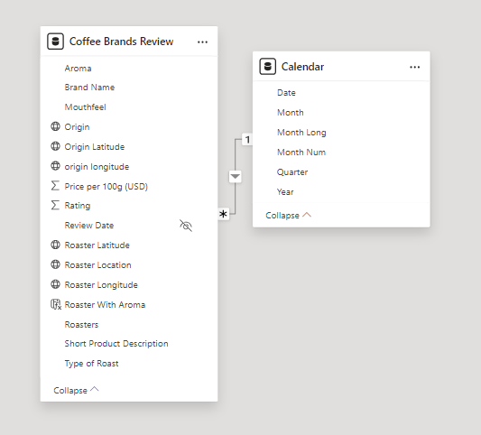
2. Building a Relational Data Model
Secondly, we modeled the data to create a snowflake schema. This process involved creating relationships between the dimension and fact tables, ensuring cardinalities were one-to-many relationships.
We enabled active or inactive relationships and hid the foreign keys from the report view to ease the data analysis and visualization steps and reduce errors.
3. Creating Calculated Columns and Measures
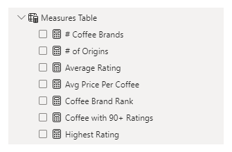
Next, we used Power BI’s front-end formula language, DAX, to analyze our relational data model and create several calculated columns (for filtering) and measures (for aggregation) that we could later reference and use when analyzing and visualizing the data. The list of calculated measures includes key information on number of coffee brands, number of origins, average rating, average rating per coffee, coffee with 90+ ratings, coffee brand rank and highest rating.
4. Visualizing the Data
The final step of the project was creating a multi-page interactive dashboard, including a range of visuals and KPIs that could serve management and lead to informed decision-making. We used several visuals and tools to demonstrate and visualize the data across 3 report pages, including KPI cards, line, column and bar charts, matrices, scatter chart, donut chart, and maps. We ensured the report was fully interactive and simple to navigate, with icons used to enable filters, cancel filters, and guide users to each report page with ease. Features such as drill-through, bookmarks, and parameters were also used throughout the dashboard, further enhancing its usefulness and impact on management.
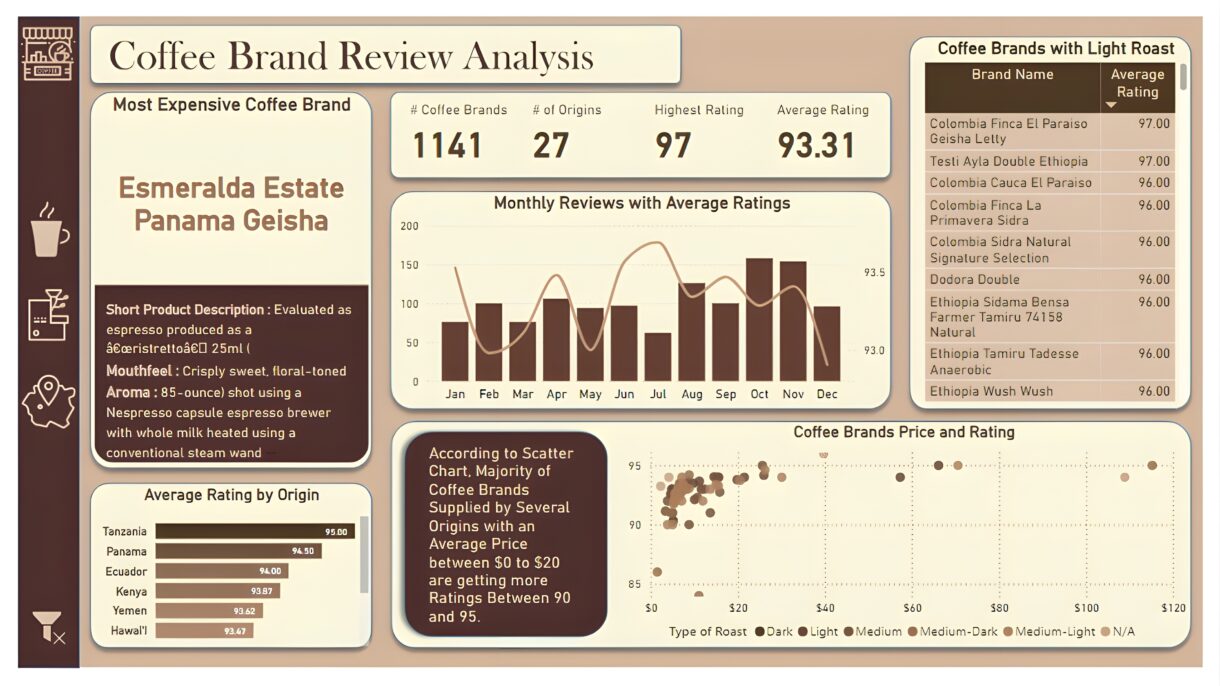
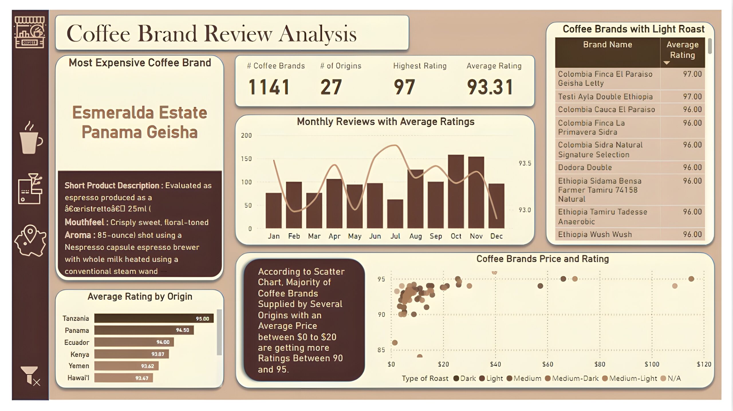
Overview Dashboard: The first report page provides a high-level view of overall performance. We used card visuals to present Key Performance Indicators such as number of coffee brands, number of origins, highest rating, and average rating. We also included additional card to present the most expensive coffee brand including its short product description, mouthfeel and aroma, a line and column chart to display monthly reviews with average ratings, a bar chart to show top 10 origins with average rating, a matrix that displays coffee brands with light roast, and a scatter chart to show relationship between coffee price and ratings.
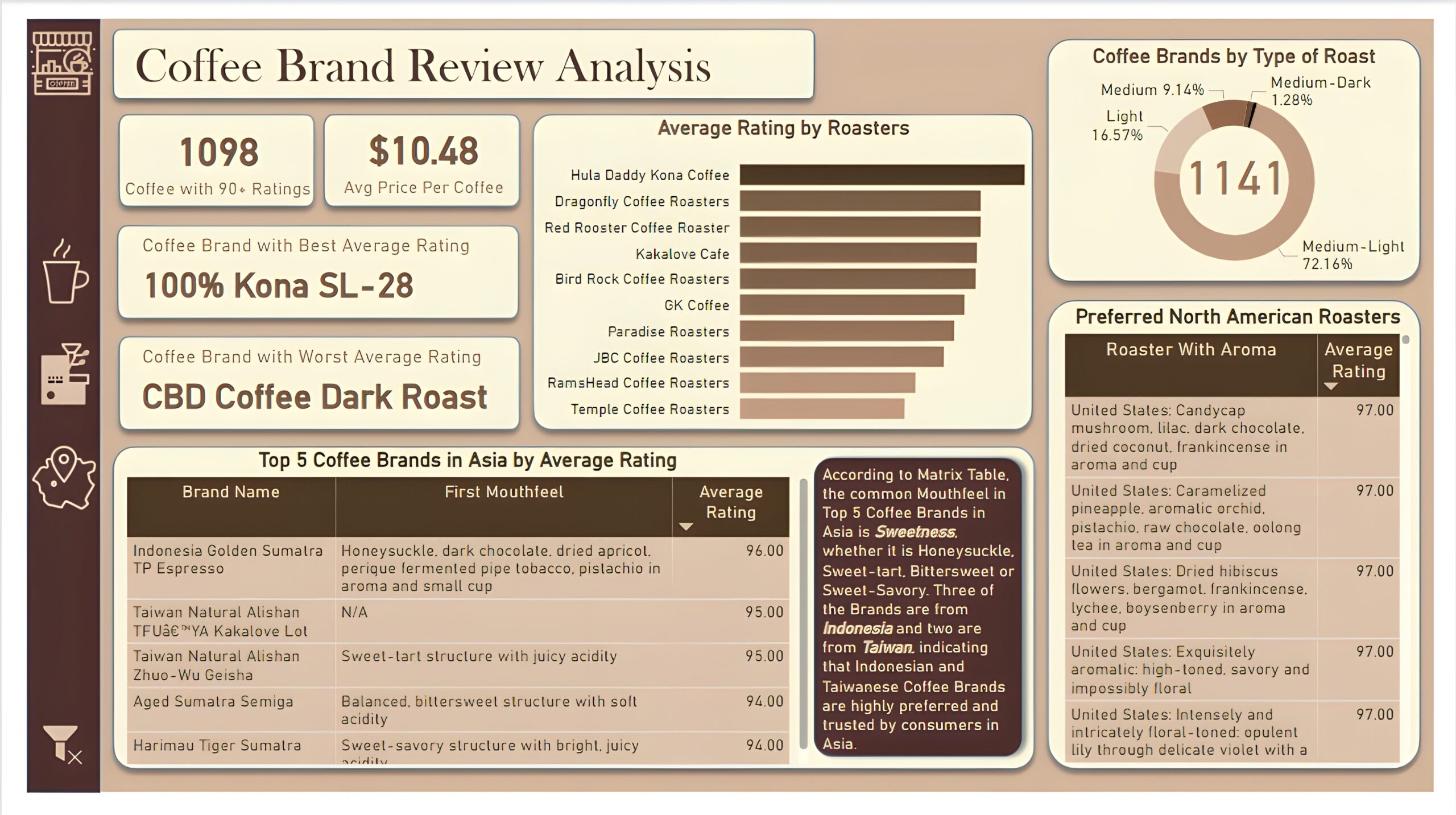
Brand and Roaster Performance: The second report page focuses on brand and roaster analysis. It displays information such as number of coffees with 90+ ratings, average price per coffee and names of coffee brands with best and worst average rating, a clustered bar chart to visualize average rating by roasters, a donut chart to display coffee brands by types of roasts, a matrix that shows the top 5 brand names in Asia by average rating, including mouthfeel and average rating of those brands, and another matrix chart that displays preferred coffee roasters of North America with their aroma and average rating.
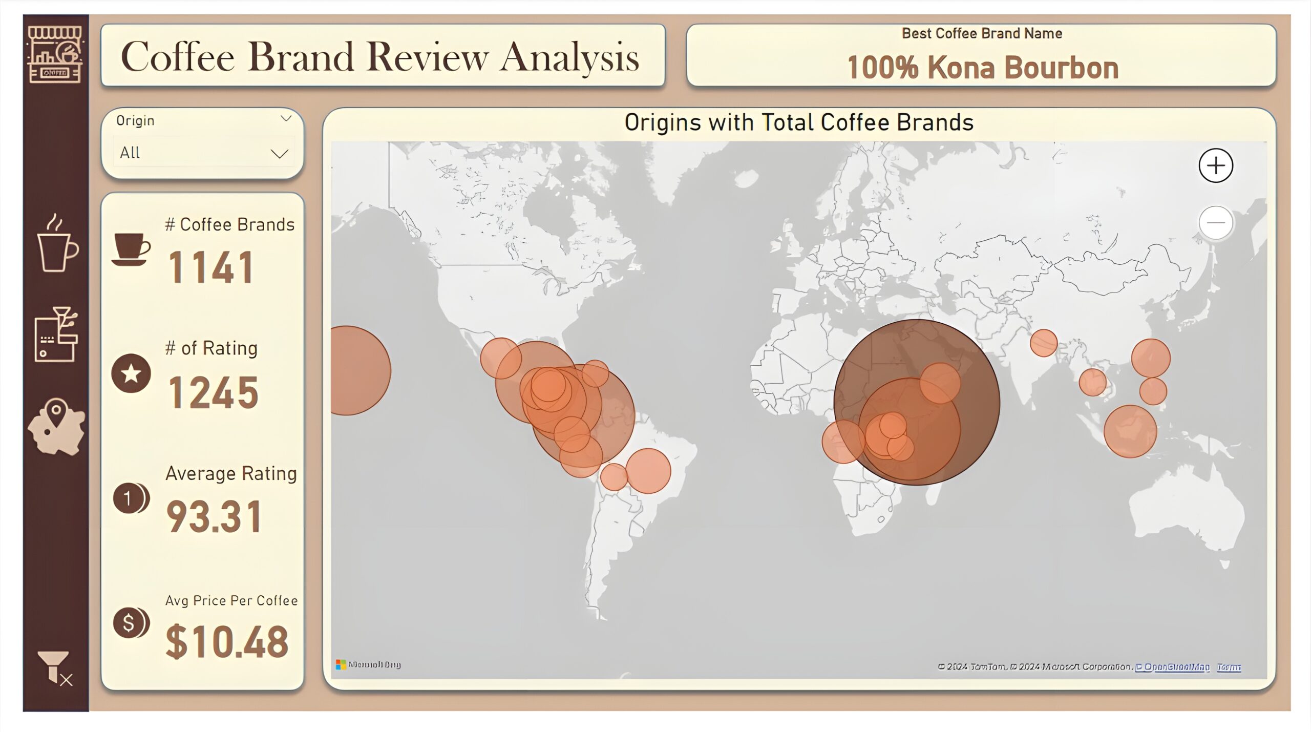
Coffee Origin: The third and last report page is a drill-through page by coffee origin to further analyze the performance in a specific origin. We have included a slicer that allows user to filter and view data based on any coffee origin throughout the entire report. The report consists of a card that displays best coffee brand name of each origin. Additional cards are used to show number of coffee brands, number of rating, average rating, and average price per coffee. And a map chart that visualizes origins with most number of coffee brands.