


EV Sales Analysis (Power BI)
The Situation:
EV Sales Analysis is a fictional collection of data related to its sales across various states of India. It encompasses multiple attributes, such as electric vehicle sales, vehicle category, makers, state, etc. Our goal is to transform their raw data into meaningful insights and recommendations for management. More specifically, we need to:
- Track KPIs (electric vehicle sales, total vehicles sales, penetration rate, average EV sales)
- Compare state-level performance
- Identify high-value makers and vehicle category
The Data:
We’ve been given a collection of raw data (CSV files), which contains information about electric vehicles sold, total vehicles sold, state, maker, vehicle category, sales date, and fiscal year in three tables from 2021-24.
The Task:
We are tasked with using solely Microsoft Power BI to:
- Connect and transform/shape the data in Power BI’s back-end using Power Query
- Build a relational data model, linking the 4 fact and dimension tables
- Create calculated columns and measures with DAX
- Design a multi-page interactive dashboard to visualize the data in Power BI’s front-end
The Process:
1. Connecting and Shaping the Data
Firstly, we imported the data into the Power Query editor to transform and clean it. The process involved:
Data Type Conversion: Columns were converted to appropriate data types to ensure consistency. Dates were converted to Date type, numerical columns to Decimal or Whole Numbers, and text columns to Text.
Standardizing Date Formats: All date columns were formatted consistently to facilitate time-based analysis. This step was important for ensuring accurate time-series analysis in Power BI.
Date Component Extraction: Extracted the month from date entries to enhance time-based analysis.
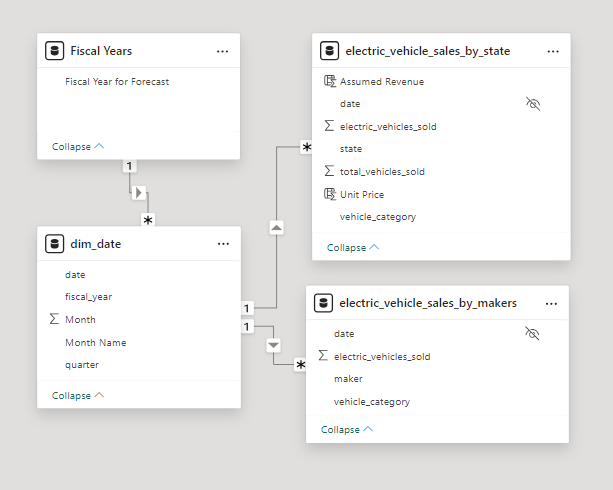
2. Building a Relational Data Model
Secondly, we modeled the data to create a snowflake schema. This process involved creating relationships between the dimension and fact tables, ensuring cardinalities were one-to-many relationships.
We enabled active or inactive relationships, created hierarchies for fields such as Date (Fiscal Year-Quarter-Month), and finally hid the foreign keys from the report view to ease the data analysis and visualization steps and reduce errors.
3. Creating Calculated Columns and Measures
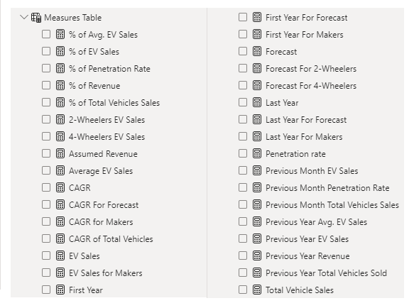
Next, we used Power BI’s front-end formula language, DAX, to analyze our relational data model and create several calculated columns (for filtering) and measures (for aggregation) that we could later reference and use when analyzing and visualizing the data.
We used calculated columns to determine assumed revenue. The list of calculated measures includes key information on EV sales, penetration rate, CAGR, total vehicle sales, and more.
4. Visualizing the Data
The final step of the project was creating a multi-page interactive dashboard, including a range of visuals and KPIs that could serve management and lead to informed decision-making. We used several visuals and tools to demonstrate and visualize the data across 3 report pages, including KPI cards, column, line and bar charts, matrices, funnel, slicers, and maps. We ensured the report was fully interactive and simple to navigate, with icons used to enable filters, cancel filters, and guide users to each report page with ease. Features such as drill-through and bookmarks were also used throughout the dashboard, further enhancing its usefulness and impact on management.
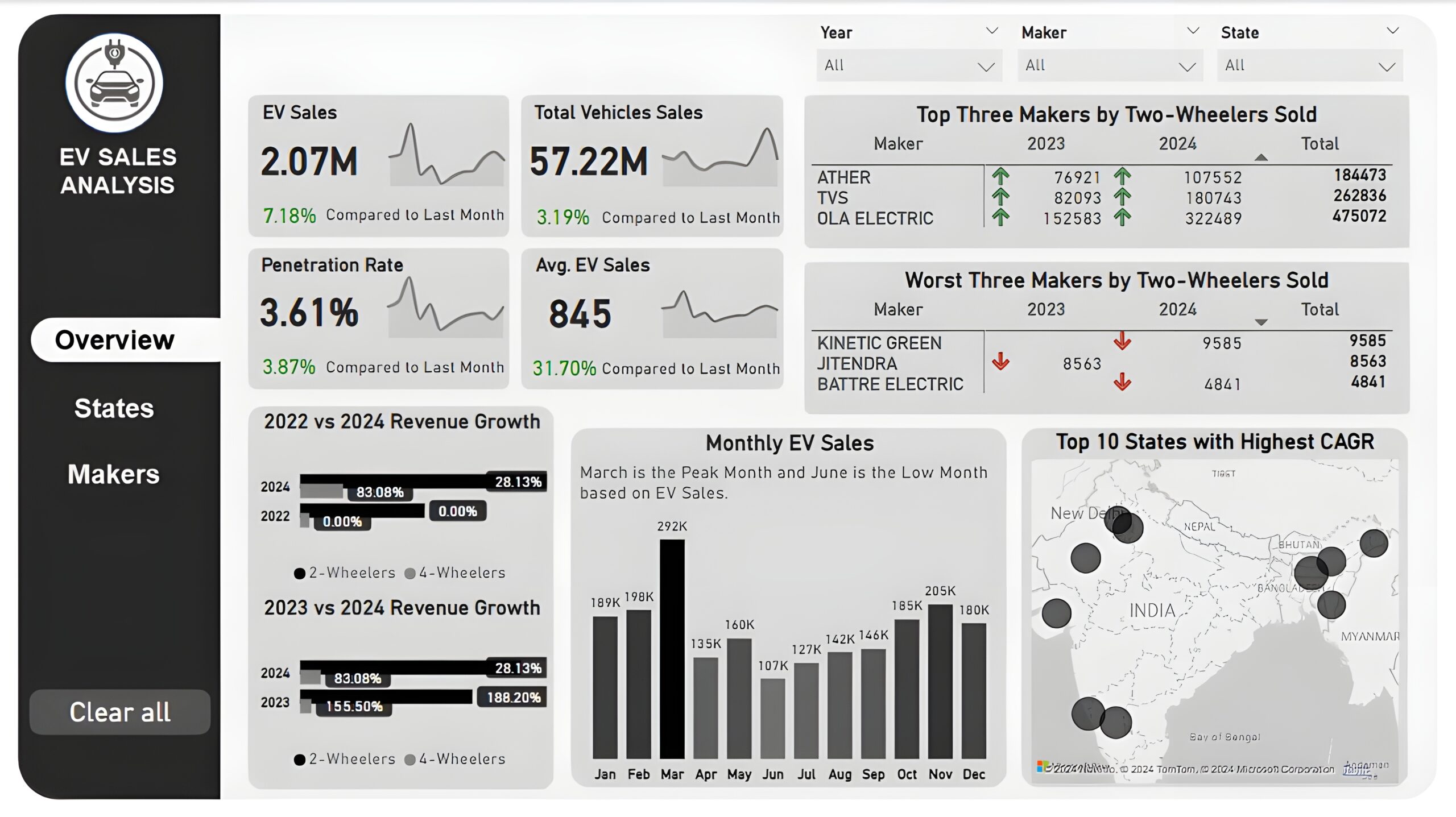
Overview Dashboard: The first report page provides a high-level view of overall performance. We used card visuals to present Key Performance Indicators such as electric vehicle sales, total vehicle sales, penetration rate, and average electric vehicle sales, with each KPI displaying monthly trends and last month’s performance. We included two matrices to display the top three and worst three makers by two-wheelers sold in the year 2023 and 2024, two clustered bar charts to compare the revenue growth rate of 2022 vs 2024 and 2023 vs 2024, a column chart to show monthly EV sales, and a map chart to display top 10 states with highest CAGR in total vehicles sold.
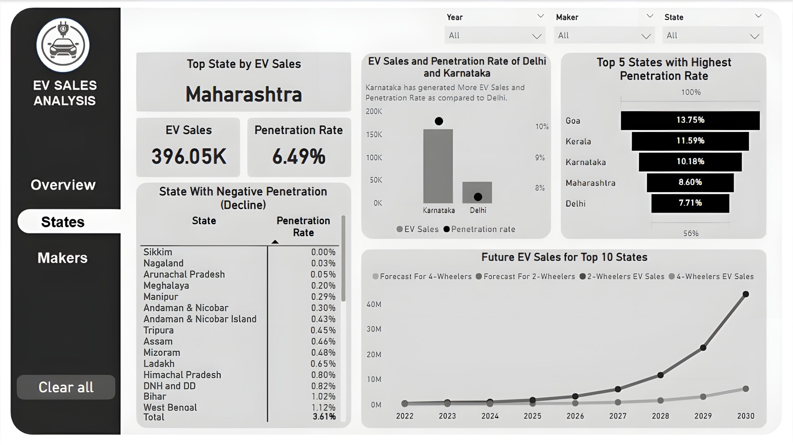
States : The second report page is a destination page by states to further analyze the performance in a specific state. It consists of KPI cards to display the top state, its EV sales, and its penetration rate. A line and column chart is used to compare EV sales and penetration rate between Delhi and Karnataka, a funnel chart to show the top 5 states with the highest penetration rate, a matrix chart to display states with negative penetration rates, and a line chart to display forecasting for ev sales of top 10 states from 2022 till 2030.
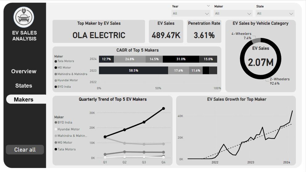
Makers: The third and final report page provides a more detailed analysis of makers. It consists of cards that display the top EV maker, its total EV sales and penetration rate, a 100% stacked bar chart to show the CAGR of the top 5 makers from 2022 to 2024, a donut chart to display EV sales by vehicle category, a line chart to show ev sales trend of top 5 makers by quarters, and another line chart to visualize ev sales growth of top maker.