


Udemy Course Analysis (Power BI)
The Situation:
Udemy Course Analysis is a collection of data related to the sales of thousands of online courses related to business finance, graphic design, web development, and musical instruments. It encompasses various attributes, such as revenue, course name, duration, etc. Our goal is to transform their raw data into meaningful insights and recommendations for management. More specifically, we need to:
- Track KPIs (revenue, total courses, total subscribers, total lectures, total reviews, average revenue per customer)
- Compare course type and price category performance
- Identify high-value courses and course subjects
The Data:
We’ve been given a collection of raw data (CSV files), which contains information about course title, price, number of subscribers, subject, published timestamp, and more, in a single table, from the years 2011-17.
The Task:
We are tasked with using solely Microsoft Power BI to:
- Connect and transform/shape the data in Power BI’s back-end using Power Query
- Build a relational data model, linking the 2 fact and dimension tables
- Create calculated columns and measures with DAX
- Design a multi-page interactive dashboard to visualize the data in Power BI’s front-end
The Process:
1. Connecting and Shaping the Data
Firstly, we imported the data into the Power Query editor to transform and clean it. The process involved:
Removing Duplicates: Duplicate entries were removed from the dataset to ensure accurate analysis.
Data Type Conversion: Columns were converted to appropriate data types to ensure consistency. Dates were converted to Date type, numerical columns to Decimal or Whole Numbers, and text columns to Text.
Standardizing Date Formats: All date columns were formatted consistently to facilitate time-based analysis. This step was important for ensuring accurate time-series analysis in Power BI.
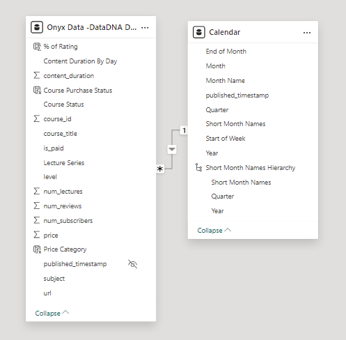
2. Building a Relational Data Model
Secondly, we modeled the data to create a snowflake schema. This process involved creating relationships between the dimension and fact tables, ensuring cardinalities were one-to-many relationships.
We enabled active or inactive relationships, creating hierarchies for fields such as Date (Year-Quarter-Month), and finally hid the foreign keys from the report view to ease the data analysis and visualization steps and reduce errors.
3. Creating Calculated Columns and Measures
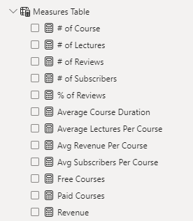
Next, we used Power BI’s front-end formula language, DAX, to analyze our relational data model and create several calculated columns (for filtering) and measures (for aggregation) that we could later reference and use when analyzing and visualizing the data.
We used calculated columns to determine whether a course is very cheap, cheap, moderate or expensive.
The list of calculated measures includes key information on revenue, total subscribers, total courses, average course duration, and more.
4. Visualizing the Data
The final step of the project was creating a multi-page interactive dashboard, including a range of visuals and KPIs that could serve management and lead to informed decision-making. We used several visuals and tools to demonstrate and visualize the data across 3 report pages, including KPI cards, line, column, and bar charts, matrices, donut charts, and decomposition trees. We ensured the report was fully interactive and simple to navigate, with icons used to enable filters, cancel filters, and guide users to each report page with ease. Features such as bookmarks and parameters were also used throughout the dashboard, further enhancing its usefulness and impact on management.
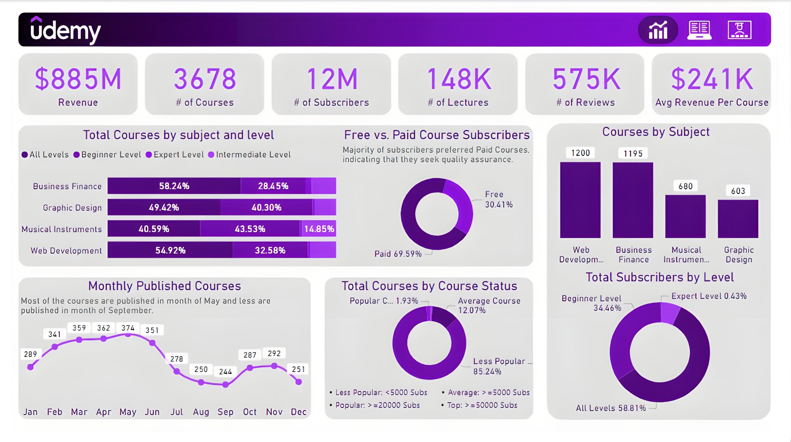
Executive Dashboard: The first report page presents an overview of overall performance. We used card visuals for KPIs like revenue, total courses, total subscribers, total lectures, total reviews, and average revenue per customer. A 100% stacked bar chart is included to visualize the partition of total courses in different course levels of other subjects. We have used three donut charts, the first chart shows a comparison between free and paid course subscribers, the second chart shows total courses by course status and the last chart shows the total subscribers at each level. A column chart to display the total courses by subjects and a line chart to show the monthly trend of published courses.
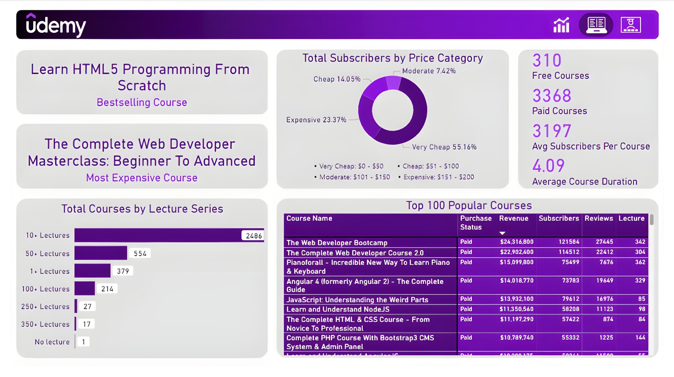
Courses: The second report page dives into course performance analysis. It consists of cards to present the bestselling course and most expensive course. Additional cards were included to show the number of free courses, paid courses, average subscribers per course, and average course duration. A donut chart to show total subscribers by price category, a bar chart to display total courses by lecture series, and a matrix chart to present the top 100 popular courses with their purchase status, revenue, subscribers, reviews, and lectures.
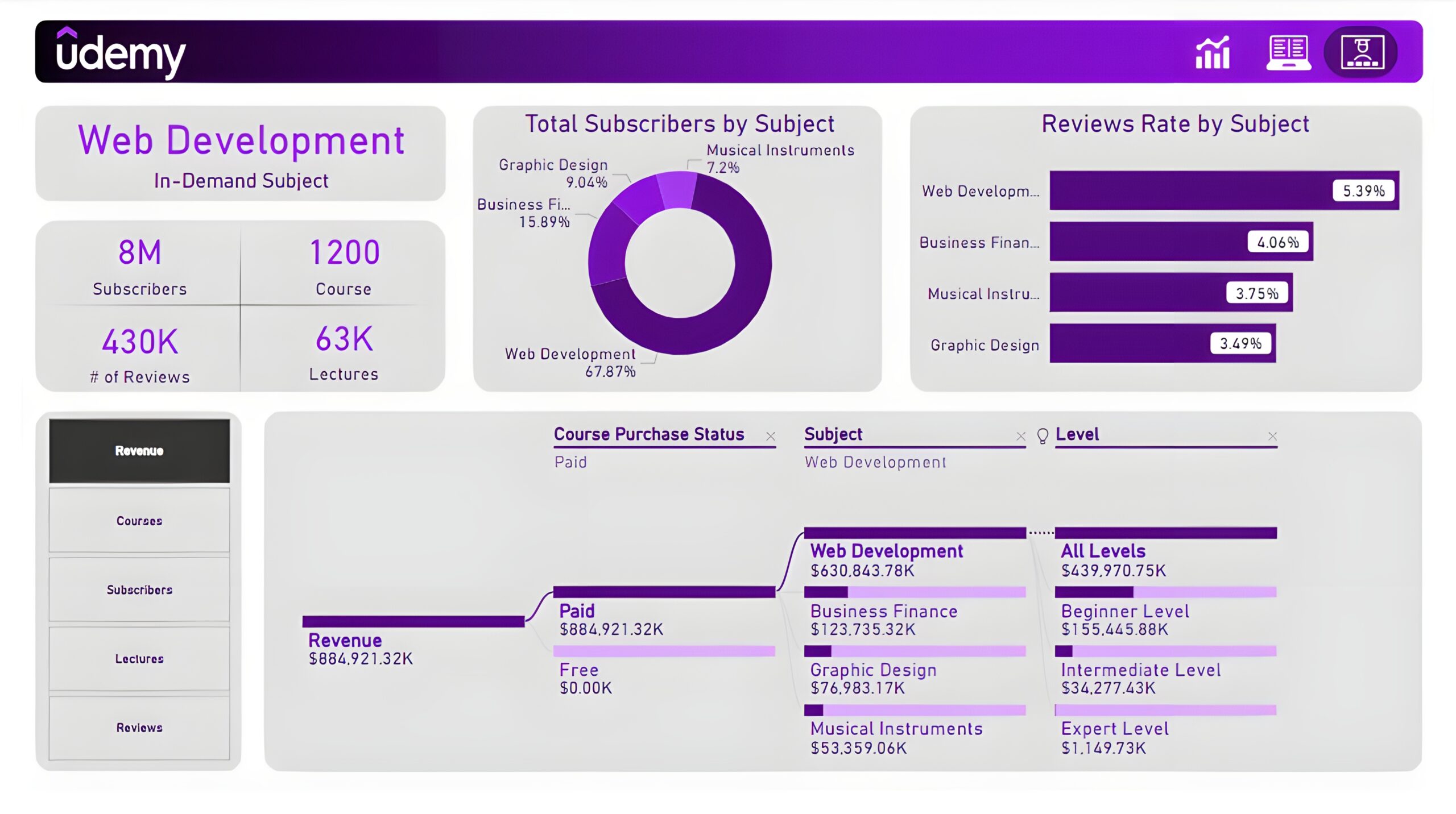
Subjects: The third and final report page provides deep insights into the course subject. Cards to display in-demand subject, its subscribers, its courses, its reviews, and its lectures. A donut chart shows total subscribers by subject and a bar chart shows the review rate by subject. Lastly, a decomposition tree chart is used to analyze measures such as revenue, course subscribers, lectures, and reviews by course purchase status, subjects, and levels.